Tuesday, December 28, 2010
Jandek Selected Album Cover Gallery
Jandek is one of the strangest stories in the whole of recorded music. Starting in 1978, Jandek released a steady stream of albums, most of which were amateurish and barely listenable. He did not release them conventionally, sending them instead of radio stations and shipping them mail-order to anyone who requested them (not for free but for a price so low that it eliminates any suggestion that he was in it for the money). Until 2004, absolutely nothing was know with certainty about the man except that he lived in Houston: he refused requests for interviews and made no attempt at conventional 'marketing'. Due mostly to his tunelessness, a Jandek cult was slow to grow. Due mostly to his tenacity, sooner or later it did arrive. Starting in 2004, he appeared in public for the first time, and it appears that slowly (perhaps upon retiring from whatever his day job once was) he has decided to 'play the game' at least a little bit. By his own rules, of course, which is how it's always been. Jandek is influenced by no one and has influenced no one. He exists entirely outside of the music industry, and for that reason he's fascinating. The contents of his albums are at times less interesting than their very existence, and are rarely conventionally listenable. His album covers are an important part of his mystique, but in this case we're not speaking of an amateurish naïf: it's my opinion that many of these covers are excellent in their own way. Jandek clearly old photos he has lying around as his source, and as a photographer he never seems to go out of his way to shoot anything above the mundane basics of his surroundings (if he is indeed the photographer, which - particuarly since he features in many of them as subject - is by no means beyond dispute). And yet a good many of these covers reveal an eye for finding beauty in the mundane. I'm not doing a complete gallery of all 66 Jandek album covers - as that would take too long and dull the impact through endless repetition. But here are nineteen that, to me anyway, really stand out.
Ready for the House, from 1978, is Jandek's début, and immediately the cover art is striking. It's just a chair and a window, with some books and maybe an ashtray. What is striking is (a) those jurid colours, and (b) the fact that no element in the cover is actually the focus, or in any way seems like 'album cover' material. Jandek plays music as if he was unaware that anyone else out there was actually making music. His approach to album cover design is equally sui generis.
The Rocks Crumble was Jandek's third release of 1983 and his first-ever 'electric' album. Merely a picture of a drumkit behind a wall, this cover still manages to be indistinct and creepy. The drawn curtains (famously, many Jandek covers feature drawn curtains) supply the light source that illuminates the drums. Like Jandek's music, the cover gives this impression of stumbling upon something you weren't meant to see.
Foreign Keys came out in 1985 and features a major theme from covers of the period: buildings, taken from the outside. Jandek is entering a door, not in the centre of the picture but off to the side. By now, we can call this man Jandek, but at the time of this release, it was not clear whether this man, who graced many but by no means all Jandek covers, was the singer on the albums or not: almost nothing was known about Jandek. It was this extreme level of mystery that made him so compelling (though I didn't hear of him for another ten years or so after this).
Modern Dances, from 1987, has a very similar cover to its follow-up Blue Corpse, but the latter is a central piece in his body of work whereas this one, well, isn't. But the cover is better, once again Jandek in front of a building, off-centre. But it's all more naked: Jandek is shirtless, the building is bare brick. He's facing away from the camera, looking at the more interesting stuff that is merely hinted at, crammed into the rightmost 10% of the cover.
You Walk Alone, from 1988, is Jandek's sixteenth, and while it's similar to Foreign Keys (it might be the same building), Jandek is well-dressed and has a confident, almost cocky, look on his face. And he's not entering the house but leaving it, defiantly. Maybe he's on his way to his high school prom?
On the Way has a particularly amazing cover - it's a drum kit, I guess, but the picture is so poorly taken that the whole thing is just a blue haze. Abstract art, and as amazingly weird as the contents of the album itself.
One Foot in the North, from 1991, is one of Jandek's last vinyl releases, and one of about ten or so I've held in my hands: I can be sure because I distinctly recall the 'Chinese restaurant' lettering on the back cover, the sole Jandek back cover to deviate at all from the strictest of formats - and then only in that the font is different. Otherwise, all Jandek back covers are essentially the same. Anyway, this beautiful cover looks very similar to one of his first ones, except that that was clearly a portrait, and this one looks like a photograph of Jandek's shadow, except that you can make out details of his hand at the bottom. Confounding, but utterly beautiful.
White Box Requiem, from 1996 (approximately the year I first came across this strange man's recorded output), is Jandek's third CD, but 25th album. This incredibly grainy photo, perhaps blown up from a much smaller image, shows Jandek, in suit and tie, sporting some rather magical sideburns.
I Woke Up. A complete change of pace, this one: this is a kind of still life made from garbage: a very deteriorated sofa sits in front of an overgrown shrub and is surrounded by pieces of wood. Like almost all Jandek covers, you can't come close to guessing the year the photo was taken - one might take a stab at the late seventies, but it feels more accurately like Jandek inhabits a world that knows nothing about the passage of time and is stuck, Twilight Zone-style, in some permanent Möbius-loop.
Put My Dream on This Planet is an a capella album, which is bizarre even by the standards of history's most bizarre musician. The cover is another beautiful abstract: I think it's a shoulder and arm wearing a white shirt. But it could be anything at all.
Worthless Recluse actually features Jandek posing and (kind of) smiling - as if he had decided he was shooting an album cover as opposed to choosing covers by rifling through his old photographs. The barn behind him is red as barns must be, and the land-out-of-time clearly has a rural area too.
The Humility of Pain is Jandek's 33rd, from 2002, and the second to feature covers taken 'somewhere in Europe' - clearly vacation photos from a trip overseas. Yet it's gorgeous and off-the-beaten-path, as you'd expect. It's Ireland, but once again it gives the impression of places meant to remain unseen glimpsed through stolen furtive looks where one ought not be. An invasion of privacy, but the privacy of an abandoned (or never-completed) ghost town. Somewhere in Ireland, or perhaps anywhere on the planet at all. Gorgeous.
The Place is the very next record, and it's more vacation snaps, but the tone couldn't be more different: it's not a double-exposure but a picture taken of mannequins that reflects the houses across the street in the shop window. The mannequins' lurid red and the overcast sky's dim blue contrast, and the whole thing seems to mock glamour and even 'reality', with the plastic models seeming to communicate but trapped in the density of the image. Hipgnosis has never made a cover this beautiful.
The Door Behind is from 2004, the annus mirabilus when Jandek not only released four albums but - to everyone's shock - actually started performing live, breaking the wall of secrecy that had surrounded him for a quarter of a century. So these covers have to be seen now as creations of someone more conscious of an audience than he had previously been - and this castaway-Jandek, or perhaps captive-Jandek, with stern eyes glaring at the camera like that Afghan girl, might well be an attempt to comment on Jandek's public image (much like naming an album 'Worthless Recluse').
A Kingdom He Likes is the very next cover, and the contrast is striking: like the last was 'old Jandek' and this one is 'new Jandek', comfortable in his own skin and happy to be the centre of attention. He wears his hat like a Texan, and that wooden wall frames him wonderfully. He seems unnervingly normal here.
Khartoum: but not anymore. This goes way back into the weird as its cover, and the cover of the one preceding it, have Jandek looking like a Muslim convert. Nothing in Jandek's music suggests any such thing (though there are a lot of Christian references scattered across his albums), so perhaps he just grew a beard, put on a cleric's hat, and liked the effect. The deep blue monochrome is lovely, and the cover is a return to that out-of-focus feel you get from so many of his covers.
Glasgow Monday is his third live album - in typical form, he appears to have decided to release every concert he plays, and so far has put out 16 live albums, four in Glasgow. Most feature snaps taken from the city where the album was recorded, often with a posed Jandek in front. This one shows an abandoned structure - a farmhouse perhaps - in the rolling green hills of somewhere-in-Europe, or perhaps Scotland. I imagine Jandek has an eye for lonely places like this, and probably pulled the car over for a snap while travelling from here to there.
Glasgow Friday is Jandek's seventh live album, and his 52nd overall, believe it or not. Not a mere farmhouse but some castle, this is probably a tourist destination, and so by rights ought to be a more traditional holiday snap. Yet however Jandek takes his pictures he invariably manages to give them a sense of gloom and a sense of loneliness: this was taken on a cold December day after the nuclear bomb had destroyed all signs of life on the planet excluding atonal guitarists from Texas. How come my holiday snaps never look like this?
London Tuesday: or this? This is as simple as it gets, Jandek is touring Europe, is on a hill in front of a fence, and stops to pose for a tourist snap, urban life sprawled out beneath him. But here's the thing: this may well be London (it'd be logical), and his age in the picture suggests it must be from the 2000s, a relatively recent picture when the CD was released. Yet somehow - like every other album cover Jandek's released across thirty-plus years - it completely belies its date of origin. It's a trick Jandek is very adept at pulling off, and even though Jandek is clearly posing, and even though his head is in dead centre of this picture, it's somehow very much a Jandekesque cover, as beautiful as many of the others even as it remains entirely confounding. Like everything about Jandek.
Saturday, November 13, 2010
Impulse! Records Gallery #1: 1 to 25
One of the main touchstones for album cover design is the Impulse! Records catalogue - or, that is to say, one of the main touchstones is 1960s jazz cover art, as best exemplified by Impulse! Records. I'm not sure that the 1960s Impulse! catalogue is really quite as revolutionary as many would have you think, but if nothing else they are certainly iconic (so much so, in fact, that their impact might have been blunted by the very extent to which they've entered the popular consciousness) and evocative of the style of music presumably held within: modern, tasteful, and most of all, cool. I think these covers are about the best visual representation of 'cool' out there.
I'm going through the catalogue according to catalogue number, not chronological order. Presumably, they're roughly the same, but inevitably never quite are. These are numbers 1 to 25.
The first one, and already the ethos is there: a great cover photograph, in this case two very hip men with their trombones and an attention-grabbing strip of yellow, and a lot of text in a clean font with different colours. The text is a bit too in-your-face, but they're getting there.
This is the Impulse! look exactly. Clever 'math' title in bright colours and a dignified font, beautiful mysterious live photo that is mostly black in colour. God knows how much black ink got used at the Impulse! printing press.
Two of the first three Impulse! albums are by a trombonist I've never heard of. This is less iconic, and kind of Martin Denny/'exotica'-styled, but it's clever, with Mr Winding's trombone quite literally in-your-face.
This potentially could be cheesy, with Gil Evans on a chair staring at the giant hole that's formed in the wall next to him. But somehow it works, with lurid reds paying no attention at all to the album title.
Impulse! could have stopped here. That blue-tinted monochrome close-up, that modish sixties text in complementary colours... this says everything you need to know about jazz album art.
A bit knocked-off by comparison. Mostly because the cover art fails to impress, I guess, looking like 'just any old photograph'. Nice colour scheme though, evoking the pan-African colours.
It wasn't easy to find a good picture of the cover for this album, perhaps because its exclamation-point-overdose title is tough to Google. Art Blakey seems happy enough, drumming in the pitch black. Happy? That's not something you see on many of thse covers.
Nice, but the approach is already slipping into cliché. This is Impulse!-cover-by-design. The results are good but not gorgeoush, and way too much importance given to record label logos (I'm guessing that garish GRP logo was tacked on later).
The obvious follow-up to 'Out of the Cool' doesn't apparently, feature Gil Evans at all except on the cover. They've patched up that red wall well enough.
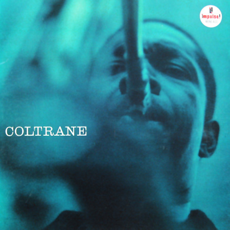
More of the same, let's be honest. It's a good 'same', with Coltrane the colour of lava and nothing else but his instrument up close and blurry plus a lot of blackness. A baby blue strip houses the logo and winds up drawing the eys perhaps more than it should.
It all comes down to the cover photo, I guess. This is a beautiful, sombre, thoughtful picture, so the cover is a success. That baby-blue sure sticks out, doesn't it?
Green and yellow! Where did they come from? A very 'bokeh' picture turns Carter's sax into a mess of bright colours, but it puts some energy into a series of beautiful but sleepy covers.
Monchrome on deep black, bell of the instrument in close-up. Text in all caps with complementary colour scheme. Yep.
I had a hard time believing this was legit, since it seemed to be typeset in Courier New. Then I remembered that there used to be a thing called a 'typewriter'. Otherwise, very standard. Pretty, but standard.
It's amazing in rapid succession just how samey these are. Impulse! certainly attracted big names, though, didn't it?
A change, this time out, in that it's an illustration and not a photograph. Still, a noteworthy change. It gives the album a different feel, even if it's still monochrome with lots of black.
Interesting. Being off-centre is a nice touch. It has the 'cool' that I think some of these other covers were starting to lose, even if the text looks like it's piled up on the guy's head.
Pretty, if generic. The photo is clearly posed this time, and why not? Why have all your covers be live peformances? Otherwise, italic, yay.
Manny gets just a tiny filmstrip. This is what cheesy discount album covers looked like in the 60s, but they were presumably copying this and not the other way round. The tracklist takes up most of the cover, but it's still a nice change. Even if it's still really, really black.
Now this is cool. This guy could be a country singer, a prison inmate, or the president of France. Whoever he is, he oozes cool from pockmarked pores. Brown not black, and the numbers look nice. Like an evil 'Sesame Street'.
A pretty well-known cover. Actually it looks like very little thought went into this, but it stands out because blue is the dominant colour and black is secondary, not the other way round. Apart from that, just Coltrane in performance.
And this is lovely indeed. The cover this time is designed, not merely assembled according to specific rules. Two silhouettes look at each other in front of a red background. At first glance it looks like abstract art. Nice.
Very unexpected from Impulse! The quartet in a foret somewhere, looking lost. Very green, and way more pastoral than Impulse! records tend to be. The first cover that actually looks like it wasn't shot sometime past midnight.
Interesting for being text-based, like "Jazz Goes to the Movies" in black with a tiny photo, but this kind of looks like the dust jacket of a million 1960s books that I find in yard sales everywhere.
The last one, this time out in part one, this is a folk singer, of all things. It's a thoroughly Impulse-ised cover, though. He still looks like Woody Guthrie, but the cover's dark black and the text is in cool colours, all-caps. Fusion!
Saturday, October 16, 2010
Weezer Cover Gallery
Weezer started off as a college-rock, indie-era proposition that, since it was the early nineties, walked a tightrope between ironic parody and heartfelt appreciation for the cheesiest aspects of the mainstream. As they spun their flukey early successes into an entirely unexpected twenty-year career, they completely obliterated that divide and strolled more than once proudly into the big muddy of bad-taste. Yet they remain equally as loveable/loveless as they were way back when. Some good covers, though.
And this iconic piece is how we were introduced to Weezer. The geek-image that has never really gone away was more radical back then than it is now. And of course four guys in front of a single-colour background has become so iconic that Weezer themselves insist on returning to it every few years or so.
Kind of generic - the song is about unravelling a sweater; here's a sweater in close-up. The song itself is way more iconic than the single cover.
This is more iconic, as Weezer starts playing the nostalgia angle heavily - something that will always be a component of the band. The music video gives us "Happy Days", the single cover presumably a picture of Rivers Cuomo as a child. Wonder who the girl is?
More nostalgia-stuff for the début's final single. This looks like a kid's scribbles on a blackboard about soccer? Seems more contrived than "Buddy Holly" somehow.
Pinkerton is the "take us seriously" album, a lunk-headed move that failed. But the cover is gorgeous, a Japanese woodcut with the colours altered. The cover does indeed look serious, and endearing too.
...But if they wanted to be taken seriously, what's up with this cheesiness? Okay, you like Japanese imagery. But try harder.
And oddly generic live cover. Weezer really didn't want to be seen as geeks, did they?
Or... maybe not. After some time off to reconsider their strengths, they returned to the first album by cloning its cover. Green except blue. And cooler clothing. But that's it.
A really random cover. This is a European version, where they had the good sense to cover the cigarette package with the song title (in the USA they just blurred the logo out).
The four of them in front of a green background again. Oh, and an island. This feels like a style-joke that I don't get.
Japanese-only (dig the ubi on the left) and a bit strange. A guitar in close-up. Cheesy, but it feels unintentionally cheesy instead of pomo. Someone in Japan thought they'd come up with a good cover? Or were they just working under a tight schedule?
Weezer starts to fall off the radar here, but their fourth full-length has a weird enough cover - a scene from a living room in the world where the Rudolph and Frosty Christmas specials were made.
Silly song name and a weird painting of the four of them. In front of white this time. Unpleasant somehow.
Very cute. The video also features the Muppets, and this good-natured cover has Kermit wearing a Weezer t-shirt. Must have cost the label a fortune. Kids everywhere became Weezer fans. Except they didn't.
An army of those Chinese good-luck cats marching through the streets of Japan. Cute and completely random. A live ep with a title that gives no hints that it's a live ep.
Weezer's biggest-ever hit gets a rather generic cover. I guess those are rich-neighbourhood hedges, at least.
This might have just been 'the black album' if it weren't for all of those rather unattractive scribbles in the background there. Plus the lack of any Jay-Z songs.
A nice cover with the four of them colour-coded on a street corner. Sitting on the fire hydrant couldn't have been comfortable. And they really do like their wordmark, don't they?
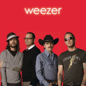
Third time not the charm. The third self-titled album with a colour-coded cover marks the point where it becomes overdone. Chicago they aren't. And they all look pretty silly.
That YouTube-all-stars video was pretty cutting edge, but the single cover is pretty generic stuff. This could be a Wilco cover. There were, incidentally, other covers. All pretty generic.
So this manga cover is a nice thing. A bit different, at least. More Japanese iconography, of course, with a woman carrying a handbag with scribbles on it.
I guess this is a still from a video or something. The four of them playing dressup again and again is making them look like a novelty band. Not exactly a horrible cover, but... for the love of God, is that Copperplate?
Wikipedia calls this a promo release. But it's got a cover (unlike many others that I've skipped), so it's here. The four of them again, bored now.
Too cheesy to talk about, really. There were other Christmas releases, but I skipped them. Should have skipped this one too, I guess.
A kind of retro 'look back'. This could be a single from the first album, really. Cute: a man and a woman's shoes, from above.
Although this is knowingly cheesy, the photobombing dog in the middle of the horribly generic living room is a cute touch. I imagine Rivers Cuomo is designing these covers himself by now, Perhaps he always did.
The single being a dying genre, Raditude didn't appear to have any more than the pre-released "I Want You To". But in the midst of sucking up to iTunes, Weezer also got nostalgic and put out a record-store-only release, which cleverly puts the flying Raditude dog in the middle of a record store - but puts the name of the album there too, confusing everyone, as it now looks like a special edition of that album as opposed to an entirely different fish.
Something to do with soccer. I don't know; sport's not my thing. But the soccer still with the title protruding from the guy's mouth is pretty gauche. And not cleverly so. Just gauche.
Good to know they took the wordmark with them when they left Geffen for Epitaph. Nice cover, this one: a plastic cup of beer on a hardwood floor. Not sure why I find it nice, but I do.
This is actually pretty clever. On the one hand, "Lost" is off the air now - too old to be cutting-edge hip, too new to be clever nostalgia. But sticking the affable Hurley character's face on a cover and adding nothing else is a good idea. It certainly sticks out and has a "WTF" value high enough to make people stop and look.
Contractual obligation, sure. But why not? Weezer seems to have decided to be as prolific as possible recently. So here's an album of offcasts from the Geffen days. The band's name is absent, the bizarre album name is present, and it's got a good random illustration of people harvesting fruit. Cheers, Weezer.
Subscribe to:
Comments (Atom)


