Saturday, October 16, 2010
Weezer Cover Gallery
Weezer started off as a college-rock, indie-era proposition that, since it was the early nineties, walked a tightrope between ironic parody and heartfelt appreciation for the cheesiest aspects of the mainstream. As they spun their flukey early successes into an entirely unexpected twenty-year career, they completely obliterated that divide and strolled more than once proudly into the big muddy of bad-taste. Yet they remain equally as loveable/loveless as they were way back when. Some good covers, though.

And this iconic piece is how we were introduced to Weezer. The geek-image that has never really gone away was more radical back then than it is now. And of course four guys in front of a single-colour background has become so iconic that Weezer themselves insist on returning to it every few years or so.

Kind of generic - the song is about unravelling a sweater; here's a sweater in close-up. The song itself is way more iconic than the single cover.

This is more iconic, as Weezer starts playing the nostalgia angle heavily - something that will always be a component of the band. The music video gives us "Happy Days", the single cover presumably a picture of Rivers Cuomo as a child. Wonder who the girl is?

More nostalgia-stuff for the début's final single. This looks like a kid's scribbles on a blackboard about soccer? Seems more contrived than "Buddy Holly" somehow.

Pinkerton is the "take us seriously" album, a lunk-headed move that failed. But the cover is gorgeous, a Japanese woodcut with the colours altered. The cover does indeed look serious, and endearing too.

...But if they wanted to be taken seriously, what's up with this cheesiness? Okay, you like Japanese imagery. But try harder.
And oddly generic live cover. Weezer really didn't want to be seen as geeks, did they?

Or... maybe not. After some time off to reconsider their strengths, they returned to the first album by cloning its cover. Green except blue. And cooler clothing. But that's it.

A really random cover. This is a European version, where they had the good sense to cover the cigarette package with the song title (in the USA they just blurred the logo out).

The four of them in front of a green background again. Oh, and an island. This feels like a style-joke that I don't get.

Japanese-only (dig the ubi on the left) and a bit strange. A guitar in close-up. Cheesy, but it feels unintentionally cheesy instead of pomo. Someone in Japan thought they'd come up with a good cover? Or were they just working under a tight schedule?

Weezer starts to fall off the radar here, but their fourth full-length has a weird enough cover - a scene from a living room in the world where the Rudolph and Frosty Christmas specials were made.

Silly song name and a weird painting of the four of them. In front of white this time. Unpleasant somehow.

Very cute. The video also features the Muppets, and this good-natured cover has Kermit wearing a Weezer t-shirt. Must have cost the label a fortune. Kids everywhere became Weezer fans. Except they didn't.

An army of those Chinese good-luck cats marching through the streets of Japan. Cute and completely random. A live ep with a title that gives no hints that it's a live ep.

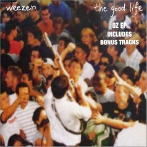
Weezer's biggest-ever hit gets a rather generic cover. I guess those are rich-neighbourhood hedges, at least.

This might have just been 'the black album' if it weren't for all of those rather unattractive scribbles in the background there. Plus the lack of any Jay-Z songs.

A nice cover with the four of them colour-coded on a street corner. Sitting on the fire hydrant couldn't have been comfortable. And they really do like their wordmark, don't they?

Third time not the charm. The third self-titled album with a colour-coded cover marks the point where it becomes overdone. Chicago they aren't. And they all look pretty silly.

That YouTube-all-stars video was pretty cutting edge, but the single cover is pretty generic stuff. This could be a Wilco cover. There were, incidentally, other covers. All pretty generic.

So this manga cover is a nice thing. A bit different, at least. More Japanese iconography, of course, with a woman carrying a handbag with scribbles on it.

I guess this is a still from a video or something. The four of them playing dressup again and again is making them look like a novelty band. Not exactly a horrible cover, but... for the love of God, is that Copperplate?

Wikipedia calls this a promo release. But it's got a cover (unlike many others that I've skipped), so it's here. The four of them again, bored now.

Too cheesy to talk about, really. There were other Christmas releases, but I skipped them. Should have skipped this one too, I guess.

A kind of retro 'look back'. This could be a single from the first album, really. Cute: a man and a woman's shoes, from above.

Although this is knowingly cheesy, the photobombing dog in the middle of the horribly generic living room is a cute touch. I imagine Rivers Cuomo is designing these covers himself by now, Perhaps he always did.

The single being a dying genre, Raditude didn't appear to have any more than the pre-released "I Want You To". But in the midst of sucking up to iTunes, Weezer also got nostalgic and put out a record-store-only release, which cleverly puts the flying Raditude dog in the middle of a record store - but puts the name of the album there too, confusing everyone, as it now looks like a special edition of that album as opposed to an entirely different fish.

Something to do with soccer. I don't know; sport's not my thing. But the soccer still with the title protruding from the guy's mouth is pretty gauche. And not cleverly so. Just gauche.

Good to know they took the wordmark with them when they left Geffen for Epitaph. Nice cover, this one: a plastic cup of beer on a hardwood floor. Not sure why I find it nice, but I do.

This is actually pretty clever. On the one hand, "Lost" is off the air now - too old to be cutting-edge hip, too new to be clever nostalgia. But sticking the affable Hurley character's face on a cover and adding nothing else is a good idea. It certainly sticks out and has a "WTF" value high enough to make people stop and look.

Contractual obligation, sure. But why not? Weezer seems to have decided to be as prolific as possible recently. So here's an album of offcasts from the Geffen days. The band's name is absent, the bizarre album name is present, and it's got a good random illustration of people harvesting fruit. Cheers, Weezer.
Subscribe to:
Post Comments (Atom)
There is shocking news in the sports betting industry.
ReplyDeleteIt's been said that any bettor needs to see this,
Watch this or quit placing bets on sports...
Sports Cash System - Sports Betting Robot
เล่นเกม สล็อต แจกเครดิตฟรี joker123 โบนัสเพียบ slot online
ReplyDeletehttps://www.slotxd.com/jokergaming123
Thank you for all of your work on this web page.
ReplyDeleteทางเข้าsbobet
michigan fake driver license
ReplyDeleteMaryland fake driver license usa
texas fake driver license
fake id
make fake driver license online
make fake id online
buy fake id online
fake texas driver license
georgia fake driver's license
uk fake driving license
michigan fake driver license
fake oklahoma driver license
oklahoma fake driver license
illinois fake driver's license
Mississippi fake driver license
fake driving license
fake illinois driver's license
georgia fake driver's license
uk fake driving license
North carolina fake drivers license
missouri fake driver license
fake missouri driver license
pensylvannia fake driver's license
fake pensylvannia driver's license
new jersey fake auto driver license
fake new jersey auto driver license
new york state fake driver license
fake new york state driver license
connecticut fake drivers license usa
ohio fake driver's license
fake ohio driver's license
buy ohio fake driver's license online usa
otona love ラブドール通販店 | ブランド正規品 | 最安値直販店: https://otona-love.jp/
ReplyDeleteおとなLOVE (otona love) は正規直販店であり、自分の生産現場を持っております。第三者に通らず生産現場から直接顧客に配送するため、TPE素材や高級シリコン製のラブドールを低価格高品質で入手できます。また、正規代理WMDOLLラブドール、6YEDOLLラブドール、メーカーから直接消費者の手元に届くようなサービスを提供させていただきます。品質保証、安心・安全への取り組み。また、新着ラブドール 特別価格¥59999円から(税込み) 新着分解型ラブドール特別価格¥66,999円から(税込み)
Apart from products, GaoMon Home Official (https://www.gaomon.com/) also strive to optimize the entire shopping process to deliver your products in the shortest possible time with the best shopping experience, and via an excellent logistics network. Our online store provides quality assurance and after-sales service for all products, and our focus is to create a shopping experience you will love. We hope to make your life more convenient through our brand.
ReplyDelete