Tuesday, June 29, 2010
Chicago Cover Gallery
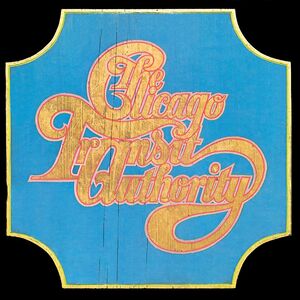
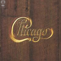
In its forty-year journey from trailblazing Blood, Sweat and Tears-style horn-led jazz-rock to corn-fed MOR gravy and then on into... well, into perpetuation for its own sake, Chicago have kept alive a remarkably strong brand identity. While their sound has changed a lot, their design aesthetic has remained constant. Both their most defining feature and their curse of anonymity, their lengthy series of albums with numbered titles (like editions of a magazine) and variations on the band logo on the cover are iconic as hell, but kind of make their albums all seem the same ("I think XIV was much better than XII. Almost a throwback to the glory days of VII.") Chicago seems, over the years, to have struggled with this, swerving from embracing the iconic design to deviating from it. On a retrospective like this, though, it's the iconic ones that catch the eye.
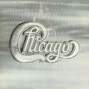
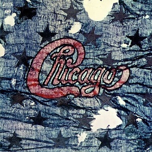
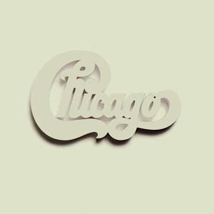
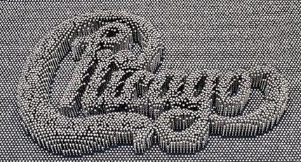
The first album is attributed to "Chicago Transit Authority", and as such doesn't follow the 'format'. But after that, this initial series of multi-album sets ('trailblazing' means 'longwinded') is among the most famous. Especially if you scour second-hand record bins. There's the sheet metal, the... er, flag or scarf or something, the one-in-white, and the wooden one. Maybe that's what Chicago fans refer to them as.
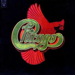
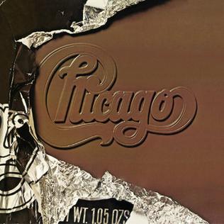
The purity of the design is falling apart a bit now. I don't know what the busy #6 is meant to be, and after the back-to-form leather one, you get 'logo plus bird', which is no design at all: perhaps this was an eraly attempt on Chicago's part to overcome the curse ("Hey, did you like the bird album?") The Greatest Hits is a lame idea, but the chocolate album pretty much perfects the concept. I don't know if even a minute of the music is worth hearing, but that is one awesome album. It deserves to be on the wall of some university kid's dorm room.
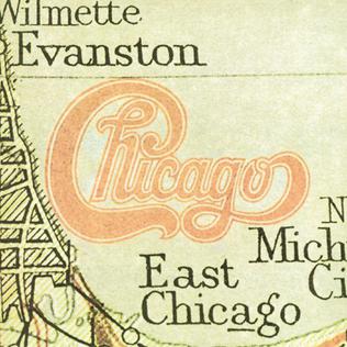
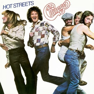
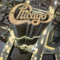
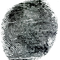
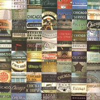
After a pretty lame 'map of Illinois' cover, Chicago decides they've had enough: for the first time, they give an album a title, "Hot Streets", and a cover so lame it defies description. Shocked back to their senses, they go back to high rise and fingerprint (which is pretty cool) before adopting a non-design of, presumably, signage in Chicago for thier second Greatest Hits album.
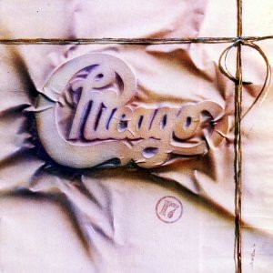
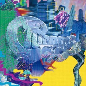
The microchip cover balances the main conceit with an attempt to give the album an individual identity, but I guess it bombed. Peter Cetera was in full force for the schlock-fest '17', with its not-bad packaging-packaging. It all goes downhill from here, though. I'm not sure I get what the next one is - stained glass? After that, the Microsoft Paint doodle is an embarrassment. And then a sadly generic Greatest Hits cover.
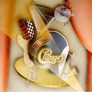
The album called 'Twenty 1' is about as stupid as it gets: keep the silly numerical title but ditch the cover design. Whose idea was that? Horribly misguided, but the band was in real freefall by now, to the pointt that they gave thier next album a name, "Night and Day", and a messy, boring, faux-retro cover. It's compilation-mania from now on. The next two look the same and evoke nothing. A Christmas album (for God's sake) follows, with a wreath.
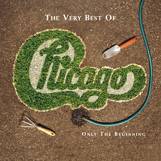
A blandly generic live album with a blandly generic cover comes next. The compilation that follows is a bit contrived, but it's a decent attempt to carry on the tradition, with the logo as roadside flower-art. The boxed set that came next has a decent 'old school' pin-impression-toy cover. The 'Love Songs' cash-in has rose petals. Lame. Shockingly, the next one is a proper album. Number thirty, as it turns out, and they avoid the temptation to theme the cover around hard liquor or porn. I don't get the cover, though. Is he shovelling snow?
No surprise - a compilation. The wax seal is kind of a 'how didn't they think of that before?' but it's quite pretty. Then the most recent one, XXXII, is actually about 15 years old or so. Only their third album with a 'name', and it's a pretty cheesy Yes-ish name, "Stone of Sisyphus". It's a big stone on the cover. And Mr. Sisyphus holding it, I guess. Hope he's not too cold.
Tuesday, June 15, 2010
New Order Cover Gallery
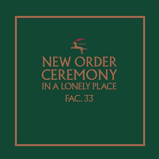
In their glory days in the 1980s, New Order were signed to the fabulously successful indie label Factory Precords, a label with a strong identity and aesthetic. No small part of that aesthetic was due to Peter Saville, who designed a good many Factory sleeves, including almost all of New Order's. Saville's specific design style is instantly recignisable, to the extent that New order's subsequent covers, released on a major label, are either miss-by-a-mile takes on Saville's style or disappointing in comparison.
The first five covers, one album and four singles, show the Seville aesthetic in embryonic form. Simple and clean, but a bit overly literal (it'll be rare after this to see titles on the covers). The album, Movement, takes excessive interest in its matrix number, FAC 50, both printing it in the centre and using the letters "F" (Factory) and "L" (50 in Roman numerals) as design. "Procession" (the second one) came out in a variety of distinct colour schemes. "Everything's Gone Green" (the fourth) was released in Belgium, where Factory had a subsidiary operation.
The central covers here employ a colour code system of Seville's own design, which by now seems merely quaint. The die-cut floppy disc cover of "Blue Monday" is meant to have cost Factory so much money that they made a loss on the wildly successful 12" release. Surely that can't be true, however. The simultaneous album, "Power, Corruption and Lies", uses the colour code alongside a romantic classic by Henri Fantin-Latour. It was recently reproduced as a UK postage stamp.
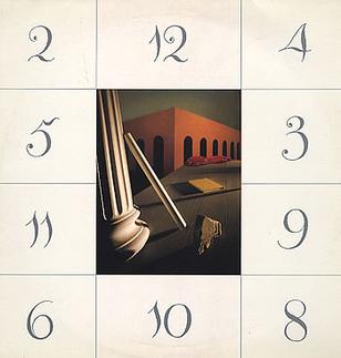
Peter Seville apparently disliked the single remix of "Sub-Culture" so much that he refused to design a cover for it. His two previous efforts, for the album "Low-Life" and the single "The Perfect Kiss", aren't overly impressive, though. "Low-Life" features distorted images of all four New order members, but drummer Stephen Morris is on the cover. The first one in this bunch, the Belgian "Murder" is described as the 'night' version to the 'daytime' of "Thieves Like Us" (previous group).
Leading toward the rather boring to-the-facts design for the "Substance" singles compilation is a decent series of abstract covers. The album "Brotherhood" bears a close-up of a piece of metal as its cover. Its two accompanying singles are... well, I have no idea what they are of.
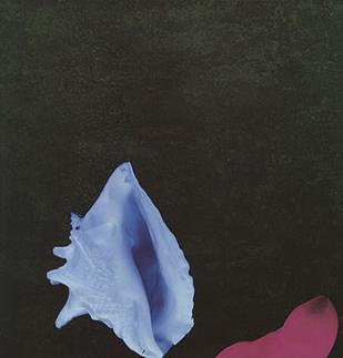
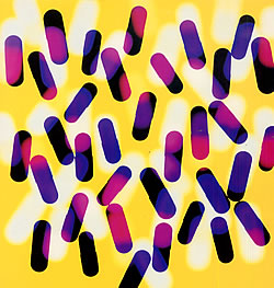
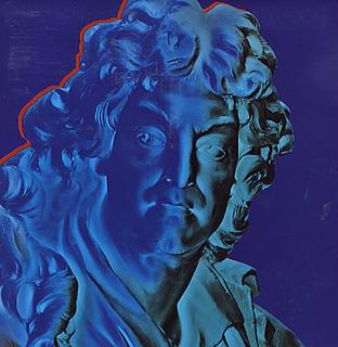
As rave culture hit England at the turn of the decade, a taste for sometimes garish colours took over. The final Factory album "Technique" and its first two singles feature what looks like a pile of pills and two statues, each done up in vivid colour plans, that unfortunately seem more dated today than the timelessness of much of Saville's best work. "Touched by the Hand of God", with its oddly-cropped seashell picture, was from the soundtrack to the movie "Salvation!". Any doubts about the importance of Peter Saville can be put to rest by considering the modish cover given to the Factory soundtrack in comparison to the rather more hideous movie posters.
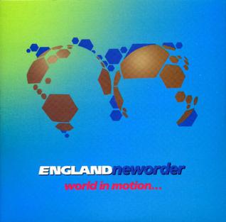
The last two Factory releases stand out... and perhaps not in a good way. "Run 2" is a curious take on laundry detergent packaging, I think, while the World Cup song "World in Motion" has a FIFA-inspired design that took New Order way closer to the mainstream than they'd previously been.
Subscribe to:
Comments (Atom)
