The 1970s were an interesting time. The sexual 'liberation' of the hippie era led to porn chic and a new era of 'openness'. Well, in a way. In the USA and most English-speaking countries, this new dynamic occurred behind walls that still carried a 1950s-era sense of morality. So you could give the impression of sexual licence, but not much more than an impression. The Ohio Players were a black funk band from the USA who today are known for two things: One, their music (slightly). Two, very sexy album covers. Let's be honest: that was the calling-card of the band, album covers that had teenage boys flipping through record racks and, perhaps, even buying the album just to take it into the bathroom with them.
A genius idea, really. When it worked... which was far from 'always', unfortunately. Winess the following skull-thing.
First Impressions: The Ohio Players didn't always feature sexy lay-dees on their covers... These rather unknown early days seem very much like a different era, and a different band. Nothing wrong with this skull-with-nose cover, mind you - it's attractive in its own way. But we know what you're really looking for...
Observations in Time: And it's not this horrid squiggly mess, certainly. Why didn't they reissue this a few years later with some random half-naked girl? Were they that uninterested in a few extra record sales?
Pain: Phase two of the Ohio Players' career is the slightly-better-known 'bald S&M chick' era. This is an interesting era, if the covers somehow fail at sheer titillation. There's something dangerous and strange here: in this four-part series, we see the same not-unattractive hairless woman in a variety of settings. Here its studded leather bondage gear, a bullwhip and an attention-grabbing armpit.
Pleasure: Part two after 'Pain', and it seems the Ohio Players are well into high concept. This is actually an impressive piece of work, one that's lost here, since the punchline is on the back of the gatefold. Here, our bald lady has her arms sensuously aloft, facial expression one of the titular pleasure. Unfold the pachage to reveal the other half, though, and you can see her arms aren't raised in pleasure but are tied over her head in chains. Kinky.
Ecstasy: More of the same bald woman, more of the same S&M leather, more of the same chains. The difference this time is there's a dude as well - or, as the back side reveals, two. Still, nothing especially impressive. And the theme is getting a bit old...
Climax: One last kick at the can for baldy, though, in what brings Stage Two to a close with an appropriate title, Climax. Baldy is looking sensuous pressed flesh-to-flesh with her man, but again there's a punchline on the back cover - but a rather more gauche punchline this time, so I'm not upset I'm not including it. The back side of the gatefold shows that the lovely lady has actually stabbed her man in the back - cheesy gush of blood and all.
Skin Tight: Onto phase three, the one so beloved of high school boys worldwide. The following albums have no real S&M sense of 'danger' or 'menace' to them. The women are conventionally beautiful and unchallengingly sexy in a way that Baldy, bless her heart, isn't. And they're all creatively and carefully posed to evoke a sleek and sophisticated kind of soft-core. After all, there may be no 'naughty bits' on these covers, but they're not far off photo shoots for Playboy - which, in its own way, is a compliment. Just knees and thighs this time. But... sexy knees and thighs.
Fire: One of the absolute classics. Our hottie is a firefighter, naked but for her fire helmet and a strategically-placed fire hose. Yes, this is mere titillation. But it's really, really well done titillation. There's even a helpfully smoky ambiance. Well done, all.
Honey: This edition's hottie uses the titular condiment in ways Winnie the Pooh never dreamed of. She's pouring honey into her mouth, and it's dripping... you know what? I'll just stop talking. The back of the gatefold features, of course, the lower half of her naked body, and it's all good and pretty, but for no clear reason someone's stuck a superfluous photo of the band above her leg. Way to spoil the mood, eh?
Rattlesnake: A bit of a regression, it would seem - but this is actually a cash-in by the Ohio Players' previous label that quite deftly melds the two eras of OP history. The logo and the photographic skill seem brand-new, but that turban is black leather and the snake brings back a kind of kinkiness that is not overly welcome. The result is not as sexy as it hopes to be but still sexier than it might have been. She's playing a snake charmer's flute, and has charmed the snake to the point that it's wrapped all around her. Sexy? Or zoophilic?
Contradiction: And speaking of zoophilia, we're back on the OPs' home territory now, their own label. But it's naked woman meets animal again, a horse this time in a cover that's rather difficult to understand and more difficult to fathom. Still has that fashion-magazine-shoot feel, but it's... I don't know. Just weird instead of sexy.
Angel: While on the one hand, this is the absolute Ohio Players masterpiece, a smouldering black and white of a gorgeous nude woman, her 'modesty' tastefully hidden by shadows. It's beautiful. But... it looks airbrushed. I don't think shadows work that way, somehow. Not that there's anything wrong with airbrushing. But it kind of falls outside the oeuvre. Still, I'm sure it looks great on teen boys' walls. Or, well, under their beds.
Mr. Mean: It's starting to fall apart for the the OP... this isn't sexy. It's just awkward. The Ohio Players themselves are standing around looking suave and sophisticated. But the completely naked woman doesn't seem suave at all. She seems tense and edgy. She's probably cold. And so is this rather misogynistic cover.
Lass-Ay-Lay-Dee: A slight return to form as we're back to fashion-magazine photography. A lighter-skinned than normal girl, not quite erotic but attractive still, in a limousine. I guess; I'm not really a car person. Oh, and by the way... god-awful album name.
Everybody Up: This one is just... so wrong. For so many reasons. Okay, the seventies became the eighties. New era. But this is a strangely sporty cover where the others have been about sophistication, and the logo is hideous. I mean the one in the corner, not the one on her chest - but that one's not much better, really. There's no fantasy here. Her nipples are quite plainly visible, and she's some girl you could meet down at the park, not a creature from the catwalks of Paris. Boo.
Tenderness: By now, the Ohio Players clearly have no idea what they're doing beyond 'girl on the cover'. This is a nice enough cover, a retro vibe all done up in white. She might be a 'flapper', if I had any idea what that word meant. But it's like it belongs to another band. Or maybe this is like an album filled with Rodgers and Hart covers.
Ouch!: All in all, the number of unattractive Ohio Players album covers is actually larger than the number of classics. I needn't have gotten 'comprehensive', right? Anyway, this woman is naked but for some red shiny thing, and she's removing a band-aid from her ass.. And I'm sorry that sentence was so vulgar. But it's merely a blunt description of the horribly vulgar cover above, with a woman clearly saying 'oooh' as opposed to 'ouch', and not even the tiniest bit sexy.
Graduation: A slight return to form, in that it has that 'vintage' feel, but it's still not alluring. She's got her mortarboard. And a bullhorn? Wait, is that the girl from Everybody Up? Took her long enough to graduate. Kanye West's bear was sexier.
Back: 'Back' as in 'a return after a four-year absence', and 'back' as in the part of a woman you can see above. She's covered in spools and spools of magnetic tape. And yet this is probably the most attractive Ohio Players cover since Jass-Ay-Lay-Dee, ten years before. I wonder if it's Baldy, perchance?
Tuesday, October 18, 2011
Sunday, September 25, 2011
Roger Dean Selected Album Covers Part 2: 1973 - 2003
Part two was supposed to follow hot on the heels of part one. But... well, that didn't really happen, did it? So I've been sitting on these happy little .jpgs for months now. And here they are, perhaps a little flattened. Pretty much everything you think of as 'a classic Roger Dean design' can be found in part two, and sadly... little else. Having found a niche, Dean finds little reason to stray from it. And I suppose that makes sense, really: as you can especially see in the latter-day work, bands call up Dean specifically because they're looking to tap into a particular vibe, to connect themselves with the music that was first illustrated by Dean himself. In particular, on these next few albums.
Badger: One Live Badger: Badgers it is, then. A naturalist landscape, wintry, with not one but two of the titular creatures, looking cute. Did they change the album title at the last minute, then?
Budgie: Never Turn Your Back on a Friend: A different band, though you could be forgiven for confusing them. No budgie on the cover this time, exactly: some mammoth sci-fi bird instead, being reined in by some guy standing on one of several inuksuit. Or not.
Greenslade: Bedside Manners are Extra: A multi-armed green wizard and a cat in front of a Dr. Seuss landscape - the landscapes are prominent now, as they always will be, but they don't quite look like Roger Dean yet. After all, there are buildings here. Really?
Magna Carta: Lord of the Ages: Right out of some German epic, a trio, perhaps of gods, ride mythical creatures on what is perhaps clouds. Animals are a really big theme in 1973, it would appear.
Snafu: Snafu: Self-titled album for obscure group named after swear-wordy army acronym. The Grim Reaper with yoked oxen on a really sunny day, and an odd layout with a black frame.
Yes: Tales from Topographic Oceans: And finally, the 'golden age' is upon us. A fantastic landscape looking right out of those kinds of paperbacks I didn't personally read when I was a teenager, it's pretty - the same combination of naturalistic and surreal that his prog-rock clients were undoubtedly hoping for. But why no ocean? Didn't read the title again?
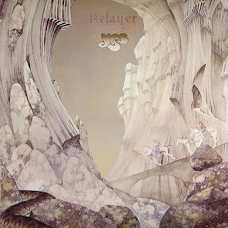
Yes: Relayer: Another Yes, two in a row, and this one is even more iconic. These are mountains straight out of Dr. Seuss, with two horses only semi-visible there in all the whites and beiges. I wonder if Dean was actually creating these pieces based on the contents of the albums, or if he just made them and Yes stuck whichever one took their fancy on the cover of their next album?
Steve Howe: Beginnings: Peter Jackson took a real risk making The Lord of the Rings as a live-action film. He knew you could only make it work with a huge budget and lots of CGI. Otherwise, you get this rather horrid cover, which attempt to portray the side-project-indulging Yes man playing from within one of Dean's landscapes, but in fact just looks ridiculous.
Dave Greenslade: Cactus Choir: Greenslade gets a particularly lovely one, with gloomy clouds, a churning ocean and a really cool mushroom-building. But weren't these artists bothered by looking so much like each other?
John Lodge: Natural Avenue: Another side-project (Moody Blues, not Yes) with a photograph, but there's no attempt at 'integration' here, so it's less embarrassing. Floating rocks, yay.
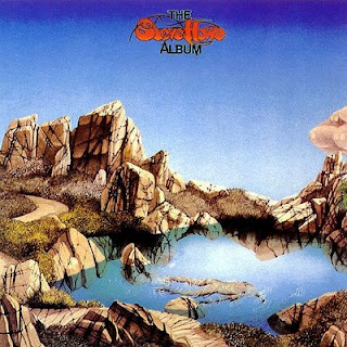
Steve Howe: The Steve Howe Album: And yet another solo jaunt. Yes, again, and this time no picture at all and also no fantasy. Craggy rocks and a pond. Or..., wait, is that a dead body floating in the pond? Well, nothing fantastic about that. Carry on, then.
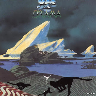
Yes: Drama: Back to the mother-band again. I'm starting to flick through the years much more quickly, and we're up to 1980, with a seeming attempt to 'update' the series, if those monochrome cats and bird are anything to go by. The result is something a bit less than impressive, I think - a turn-of-the-decade relic, though.
Asia: Alpha: Ah, Asia. There's something really unlovable about this band, even for prog rock fans. The trying-too-hard cover is fitting, then, as it's not very attractive, either. Tropical stuff mixes with some more mushroom-buildings in the background. Birds!
Barry Devlin: Breaking Star Codes: But by 1983, his time had clearly passed, and instead of updating his style, he took up whatever meagre offers were out there for his line of work. Who is Barry Devlin? I don't know, but with the flying fish, the craggy rocks and even that hand-written triangular logo, he was someone who very clearly wanted Dean-by-design, and got it.
Anderson, Bruford, Wakeman and Howe: Anderson, Bruford, Wakeman and Howe: And now we're all the way to 1989. A long story ensues about how Yes has, for all intents and purposes, split up into two camps. This one, made of the four individuals whose surnames form the band's name, are prohibited from calling themselves 'Yes'. Instead, in a rather clever move, they assert their Yes-ness with a decidedly retro 'Roger Dean original' cover, meant to evoke those 1970s covers of the band who they more or less are, even though they can't come out and say that. Fantastic trees, fantastic buildings, birds. This is exactly what ABWH were looking for. Who needs innovation?
Anderson, Bruford, Wakeman and Howe: An Evening of Yes Music Plus: Check out the title of this live album to see how desperate these gentlemen were. Trees on floating pod-islands. But it's 1993, and it's all a bit boring by now, isn't it?
Asia: Aria: I guess not. Not if you have this kind of music in your blood. You just want more and more albums that look pretty much exactly like this. And it's Asia, so don't expect innovation, right?
Steve Howe: Not Necessarily Acoustic: Whereas some musicians take the side-project as an opportunity to divert, you really have to admire the Yes people's commitment to the main brand. The dragon is a bit different, but little else is, right down to that classic 1970s hand-written album title.
Uriah Heep: Sea of Light: It's 1995 now, and another resurrected dinosaur gets a Dean-by-design. If you covered up the titles of these albums, how could you ever tell one from another?
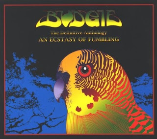
Budgie: An Ecstasy of Fumbling: My God, something different! Well, kind of. The wordmark is still post-hippie, and it's still a bird and trees. But it's not a landscape, amazingly enough., And that budgie makes me think there might actually be a sense of humour at work here. Say it isn't so. This is a compilation: maybe those bring out the best in him?
Space Needle: The Moray Eels Eat the Space Needle: Little to say about this album except that the title is cute, but the self-cloning nature of the cover is just too much to take. And that's a horrid lime-green, isn't it?
Yes: The Ladder: Hatchets buried, they've got their name back. Both Yes-by-name and cover-by-Dean. What else could they ask for? Weird spindly-mountain things. Whatever. By now, no one was even looking at these covers, I don't think. Especially since this is the CD era, so they're only five inches. I might cry.
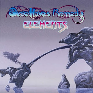
Steve Howe's Remedy: Elements: One last example, before we put Mr Dean to bed. It's Yes-man Howe again, with a band name this time, but who cares, really? This came out in 2003, 30 years after Howe and Dean were breaking ground. It's weird rock-formations rising out of the water. What else was it going to be by now?
Wednesday, June 1, 2011
Roger Dean Selected Album Covers Part 1: 1969 - 1972
The Hobbit himself. The man responsible, pretty much entirely, for the 'look' of 1970s prog music. From the mid-seventies on (the period looked at more fully in part two), a Roger Dean cover was instantly recognisable - a 'fantasy' landscape, looking like something out of an alien world. Dr. Seuss-like, I suppose.
Ultimately, the style became so recognisable that a band seeking to fit int oa certain demographic would take Dean on knowing that punters in record shops would immedaitely know what they were buying - a great advantage for budding prog-rockers, but it led Dean into self-repetition; people went to him with a very particular look in mind, and he was duty-bound to provide it.
So part two will be both Dean at his 'purest' and at his most cynical - superficially, the two are similar. Here, though, we've got a mixed bag of 'early efforts' - some great, some not. Some looking like his 'style', some not at all. Grwoing pains, I guess.
Earth and Fire: Earth and Fire: I think the gnarled roots of a tree are creepy, and clearly so does Roger Dean. This early work is not his earliest, but it's one of them. Pen-and-ink, it would seem.
Gun: Gun: This would be his very first, apparently, with a dark hellbeast vibe that has little to do with the main Roger Dean style. Reminds me of Gerald Scarfe and his work on Pink Floyd's The Wall.
Lighthouse: One Fine Morning: Very hippie-ish. Of course, Dean's style and the artists he worked with came straight out of the hippie era, but it's odd to see it so carefully aped here.
Dr. Strangely Strange - Heavy Petting: A die-cut piece - the early years have several of those. It seems that the three faces are revealed through a die cut, and the entire cover is divided into two (three, in fact) by die-cutting. I don't know what opening the flaps reveals.
Nucleus: Elastic Rock: Another die-cut piece, reminiscent of the groundbreaking "Blue Monday" New order sleeve that would come a decade later. Roger Dean certainly worked with a good many nobodies back in the day.
Atomic Rooster: In Hearing of Atomic Rooster: This is a cute pre-rock homage, like It's a Beautiful Day. Humorous.
Midnight Sun: Midnight Sun: The Roger Dean style is slowly evolving, not least of which the fact that we see that classic 'Roger Dean font' here for the first time. A cast of odd characters, a big frog, a chariot. Surreal.
Osibisa: Osibisa: The first of two for an African-British band. Flying elephant mosquitoes, just like it ought to be.
Osibisa: Woyaya: Osibisa again, with the elephant-mosquito flying over a very Roger Dean-esque pond.
Pete Dello and Friends: Into Your Ears: An earwig and a caterpillar. And a black outline, and text - this won't survive long.
Ramases: Space Hymns: Quite beautiful, really. Not overly Roger Deanesque, though it still evokes his particular mood. Pretty green.
The Keith Tippett Group: Dedicated to You But You Weren't Listening: One of th elast we'll see here with a non-'trademark' feel to it. But it's clever as hell, a woman with a baby in her head. I kind of wish Roger Dean hadn't stuck so faithfully to his one particular 'thing'.
Yes: Fragile: And the real legacy begins. The font's not there yet - in fact, nothing is, really It's a fantasy landscape, but it's an entire planet, and it doesn't really have that classic Roger Dean 'feel' quite yet.
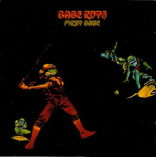
Babe Ruth: First Base: I doubt baseball is very much Roger Dean's thing. But what to do with a project where the band and the album are both named for Baseball?
Gentle Giant: Octopus: A wee bit too literal? It's called Octopus, here's an octopus. What more do you want?
Gracious!! - This is Gracious!!: No idea who Gracious!! are, but I like this naughty stained-glass idea a lot.
Midnight Sun: Walking Circles: Several thousand years ago, a mutant half-human half-meerkat frose to death on an ice floe. Reminds me of Al Gore's An Inconvenient Truth today.
Paladin: Charge!: Well, literal - a horse charging. But it's no 'Octopus redux' - the horse seems vaguely cyborg-like, and the rider seems vaguely horsey. I don't get it, but interesting.
The John Dummer Band: Blue: A die-cut masterpiece: look at it carefully to figure it out. The 'cover' itself is nothing more than a pink box with two clouds cut into it. Neither is what might be the inner side of a gatefold or what might be an inner sleeve: the 'goods' are all contained on 'layer three'. It's beautiful, even if it's not quite the right colour for the album title, and even if presumably a bit of use subjected this cover to horrid wear-and-tear.
Third Ear Band: Music From Macbeth: Well, the title screams 'prog'. This is a creepy cover of three people doing something intimate and probably unpleasant. the witches? But where is their cauldron? And whence the bubble, bubble, toil and trouble?
Uriah Heep: Demons and Wizards: I must admit - this looks like a high schooler parodying Roger Dean. It's all a bit too obvious, isn't it?
Various Artists: Motown Chartbusters, Vol. Six: How Barry Gordy got Dean's number I'll never know, and why Dean deigned to design a cover for a knock-off 'Now That's What I Call Music' type compilation I'll never know. But it's the incogruity that gets me. Giant bugship, yay.
Yes: Close to the Edge: And with his 'muses' Yes, Roger Dean manages to subvert his 'look' before he's even truly established it. I guess there are standard-Dean landscapes elsewhere in this package, but the cover is all green. Thick green fog on Planet Dean that day? Don't ask me why, but I like it.
Subscribe to:
Comments (Atom)


