The Hobbit himself. The man responsible, pretty much entirely, for the 'look' of 1970s prog music. From the mid-seventies on (the period looked at more fully in part two), a Roger Dean cover was instantly recognisable - a 'fantasy' landscape, looking like something out of an alien world. Dr. Seuss-like, I suppose.
Ultimately, the style became so recognisable that a band seeking to fit int oa certain demographic would take Dean on knowing that punters in record shops would immedaitely know what they were buying - a great advantage for budding prog-rockers, but it led Dean into self-repetition; people went to him with a very particular look in mind, and he was duty-bound to provide it.
So part two will be both Dean at his 'purest' and at his most cynical - superficially, the two are similar. Here, though, we've got a mixed bag of 'early efforts' - some great, some not. Some looking like his 'style', some not at all. Grwoing pains, I guess.
Earth and Fire: Earth and Fire: I think the gnarled roots of a tree are creepy, and clearly so does Roger Dean. This early work is not his earliest, but it's one of them. Pen-and-ink, it would seem.
Gun: Gun: This would be his very first, apparently, with a dark hellbeast vibe that has little to do with the main Roger Dean style. Reminds me of Gerald Scarfe and his work on Pink Floyd's The Wall.
Lighthouse: One Fine Morning: Very hippie-ish. Of course, Dean's style and the artists he worked with came straight out of the hippie era, but it's odd to see it so carefully aped here.
Dr. Strangely Strange - Heavy Petting: A die-cut piece - the early years have several of those. It seems that the three faces are revealed through a die cut, and the entire cover is divided into two (three, in fact) by die-cutting. I don't know what opening the flaps reveals.
Nucleus: Elastic Rock: Another die-cut piece, reminiscent of the groundbreaking "Blue Monday" New order sleeve that would come a decade later. Roger Dean certainly worked with a good many nobodies back in the day.
Atomic Rooster: In Hearing of Atomic Rooster: This is a cute pre-rock homage, like It's a Beautiful Day. Humorous.
Midnight Sun: Midnight Sun: The Roger Dean style is slowly evolving, not least of which the fact that we see that classic 'Roger Dean font' here for the first time. A cast of odd characters, a big frog, a chariot. Surreal.
Osibisa: Osibisa: The first of two for an African-British band. Flying elephant mosquitoes, just like it ought to be.
Osibisa: Woyaya: Osibisa again, with the elephant-mosquito flying over a very Roger Dean-esque pond.
Pete Dello and Friends: Into Your Ears: An earwig and a caterpillar. And a black outline, and text - this won't survive long.
Ramases: Space Hymns: Quite beautiful, really. Not overly Roger Deanesque, though it still evokes his particular mood. Pretty green.
The Keith Tippett Group: Dedicated to You But You Weren't Listening: One of th elast we'll see here with a non-'trademark' feel to it. But it's clever as hell, a woman with a baby in her head. I kind of wish Roger Dean hadn't stuck so faithfully to his one particular 'thing'.
Yes: Fragile: And the real legacy begins. The font's not there yet - in fact, nothing is, really It's a fantasy landscape, but it's an entire planet, and it doesn't really have that classic Roger Dean 'feel' quite yet.
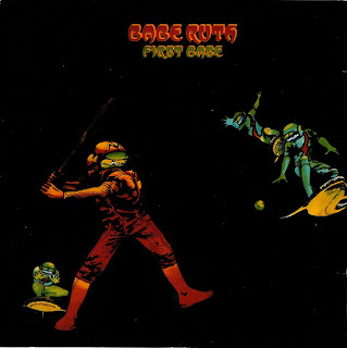
Babe Ruth: First Base: I doubt baseball is very much Roger Dean's thing. But what to do with a project where the band and the album are both named for Baseball?
Gentle Giant: Octopus: A wee bit too literal? It's called Octopus, here's an octopus. What more do you want?
Gracious!! - This is Gracious!!: No idea who Gracious!! are, but I like this naughty stained-glass idea a lot.
Midnight Sun: Walking Circles: Several thousand years ago, a mutant half-human half-meerkat frose to death on an ice floe. Reminds me of Al Gore's An Inconvenient Truth today.
Paladin: Charge!: Well, literal - a horse charging. But it's no 'Octopus redux' - the horse seems vaguely cyborg-like, and the rider seems vaguely horsey. I don't get it, but interesting.
The John Dummer Band: Blue: A die-cut masterpiece: look at it carefully to figure it out. The 'cover' itself is nothing more than a pink box with two clouds cut into it. Neither is what might be the inner side of a gatefold or what might be an inner sleeve: the 'goods' are all contained on 'layer three'. It's beautiful, even if it's not quite the right colour for the album title, and even if presumably a bit of use subjected this cover to horrid wear-and-tear.
Third Ear Band: Music From Macbeth: Well, the title screams 'prog'. This is a creepy cover of three people doing something intimate and probably unpleasant. the witches? But where is their cauldron? And whence the bubble, bubble, toil and trouble?
Uriah Heep: Demons and Wizards: I must admit - this looks like a high schooler parodying Roger Dean. It's all a bit too obvious, isn't it?
Various Artists: Motown Chartbusters, Vol. Six: How Barry Gordy got Dean's number I'll never know, and why Dean deigned to design a cover for a knock-off 'Now That's What I Call Music' type compilation I'll never know. But it's the incogruity that gets me. Giant bugship, yay.
Yes: Close to the Edge: And with his 'muses' Yes, Roger Dean manages to subvert his 'look' before he's even truly established it. I guess there are standard-Dean landscapes elsewhere in this package, but the cover is all green. Thick green fog on Planet Dean that day? Don't ask me why, but I like it.


