Part two was supposed to follow hot on the heels of part one. But... well, that didn't really happen, did it? So I've been sitting on these happy little .jpgs for months now. And here they are, perhaps a little flattened. Pretty much everything you think of as 'a classic Roger Dean design' can be found in part two, and sadly... little else. Having found a niche, Dean finds little reason to stray from it. And I suppose that makes sense, really: as you can especially see in the latter-day work, bands call up Dean specifically because they're looking to tap into a particular vibe, to connect themselves with the music that was first illustrated by Dean himself. In particular, on these next few albums.
Badger: One Live Badger: Badgers it is, then. A naturalist landscape, wintry, with not one but two of the titular creatures, looking cute. Did they change the album title at the last minute, then?
Budgie: Never Turn Your Back on a Friend: A different band, though you could be forgiven for confusing them. No budgie on the cover this time, exactly: some mammoth sci-fi bird instead, being reined in by some guy standing on one of several inuksuit. Or not.
Greenslade: Bedside Manners are Extra: A multi-armed green wizard and a cat in front of a Dr. Seuss landscape - the landscapes are prominent now, as they always will be, but they don't quite look like Roger Dean yet. After all, there are buildings here. Really?
Magna Carta: Lord of the Ages: Right out of some German epic, a trio, perhaps of gods, ride mythical creatures on what is perhaps clouds. Animals are a really big theme in 1973, it would appear.
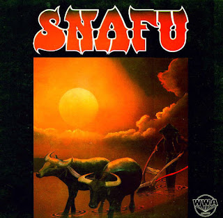
Snafu: Snafu: Self-titled album for obscure group named after swear-wordy army acronym. The Grim Reaper with yoked oxen on a really sunny day, and an odd layout with a black frame.
Yes: Tales from Topographic Oceans: And finally, the 'golden age' is upon us. A fantastic landscape looking right out of those kinds of paperbacks I didn't personally read when I was a teenager, it's pretty - the same combination of naturalistic and surreal that his prog-rock clients were undoubtedly hoping for. But why no ocean? Didn't read the title again?
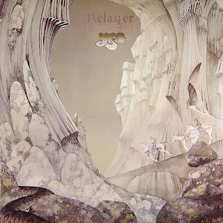
Yes: Relayer: Another Yes, two in a row, and this one is even more iconic. These are mountains straight out of Dr. Seuss, with two horses only semi-visible there in all the whites and beiges. I wonder if Dean was actually creating these pieces based on the contents of the albums, or if he just made them and Yes stuck whichever one took their fancy on the cover of their next album?
Steve Howe: Beginnings: Peter Jackson took a real risk making The Lord of the Rings as a live-action film. He knew you could only make it work with a huge budget and lots of CGI. Otherwise, you get this rather horrid cover, which attempt to portray the side-project-indulging Yes man playing from within one of Dean's landscapes, but in fact just looks ridiculous.
Dave Greenslade: Cactus Choir: Greenslade gets a particularly lovely one, with gloomy clouds, a churning ocean and a really cool mushroom-building. But weren't these artists bothered by looking so much like each other?
John Lodge: Natural Avenue: Another side-project (Moody Blues, not Yes) with a photograph, but there's no attempt at 'integration' here, so it's less embarrassing. Floating rocks, yay.
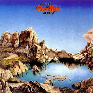
Steve Howe: The Steve Howe Album: And yet another solo jaunt. Yes, again, and this time no picture at all and also no fantasy. Craggy rocks and a pond. Or..., wait, is that a dead body floating in the pond? Well, nothing fantastic about that. Carry on, then.
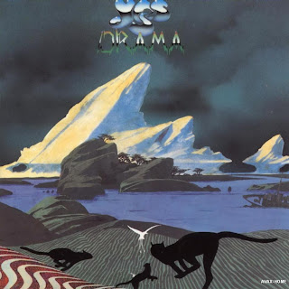
Yes: Drama: Back to the mother-band again. I'm starting to flick through the years much more quickly, and we're up to 1980, with a seeming attempt to 'update' the series, if those monochrome cats and bird are anything to go by. The result is something a bit less than impressive, I think - a turn-of-the-decade relic, though.
Asia: Alpha: Ah, Asia. There's something really unlovable about this band, even for prog rock fans. The trying-too-hard cover is fitting, then, as it's not very attractive, either. Tropical stuff mixes with some more mushroom-buildings in the background. Birds!
Barry Devlin: Breaking Star Codes: But by 1983, his time had clearly passed, and instead of updating his style, he took up whatever meagre offers were out there for his line of work. Who is Barry Devlin? I don't know, but with the flying fish, the craggy rocks and even that hand-written triangular logo, he was someone who very clearly wanted Dean-by-design, and got it.
Anderson, Bruford, Wakeman and Howe: Anderson, Bruford, Wakeman and Howe: And now we're all the way to 1989. A long story ensues about how Yes has, for all intents and purposes, split up into two camps. This one, made of the four individuals whose surnames form the band's name, are prohibited from calling themselves 'Yes'. Instead, in a rather clever move, they assert their Yes-ness with a decidedly retro 'Roger Dean original' cover, meant to evoke those 1970s covers of the band who they more or less are, even though they can't come out and say that. Fantastic trees, fantastic buildings, birds. This is exactly what ABWH were looking for. Who needs innovation?
Anderson, Bruford, Wakeman and Howe: An Evening of Yes Music Plus: Check out the title of this live album to see how desperate these gentlemen were. Trees on floating pod-islands. But it's 1993, and it's all a bit boring by now, isn't it?
Asia: Aria: I guess not. Not if you have this kind of music in your blood. You just want more and more albums that look pretty much exactly like this. And it's Asia, so don't expect innovation, right?
Steve Howe: Not Necessarily Acoustic: Whereas some musicians take the side-project as an opportunity to divert, you really have to admire the Yes people's commitment to the main brand. The dragon is a bit different, but little else is, right down to that classic 1970s hand-written album title.
Uriah Heep: Sea of Light: It's 1995 now, and another resurrected dinosaur gets a Dean-by-design. If you covered up the titles of these albums, how could you ever tell one from another?
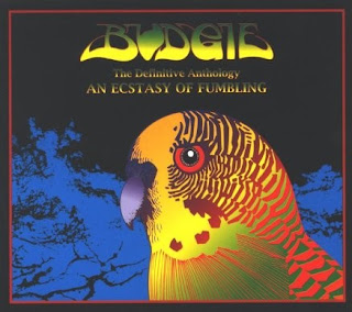
Budgie: An Ecstasy of Fumbling: My God, something different! Well, kind of. The wordmark is still post-hippie, and it's still a bird and trees. But it's not a landscape, amazingly enough., And that budgie makes me think there might actually be a sense of humour at work here. Say it isn't so. This is a compilation: maybe those bring out the best in him?
Space Needle: The Moray Eels Eat the Space Needle: Little to say about this album except that the title is cute, but the self-cloning nature of the cover is just too much to take. And that's a horrid lime-green, isn't it?
Yes: The Ladder: Hatchets buried, they've got their name back. Both Yes-by-name and cover-by-Dean. What else could they ask for? Weird spindly-mountain things. Whatever. By now, no one was even looking at these covers, I don't think. Especially since this is the CD era, so they're only five inches. I might cry.
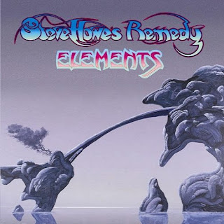
Steve Howe's Remedy: Elements: One last example, before we put Mr Dean to bed. It's Yes-man Howe again, with a band name this time, but who cares, really? This came out in 2003, 30 years after Howe and Dean were breaking ground. It's weird rock-formations rising out of the water. What else was it going to be by now?


