Showing posts with label Depeche Mode. Show all posts
Showing posts with label Depeche Mode. Show all posts
Tuesday, August 31, 2010
Depeche Mode Single Cover Gallery, Part Two
And now we're onto Part Two, the "I didn't know they had a song with that name" years. They haven't lost anything in popularity; if anything, they're selling more than they ever did. But it must just be me and my age... this half of the story is just an endless succession of singles that seem more or less the same to me. Pity, too.


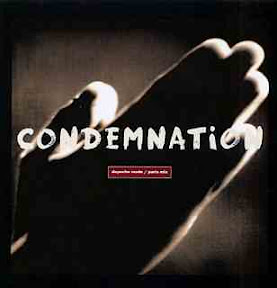

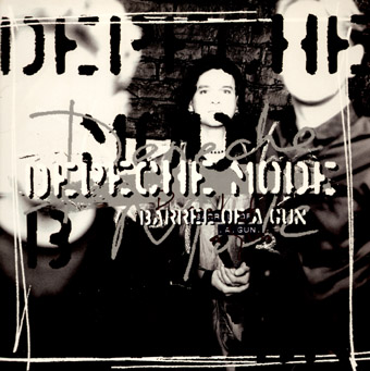
There's a 'childish handwriting' theme to the Songs of Faith and Devotion era, one that gives us single covers by and large nicer than the album cover. "I Feel You" and its hand-painted chess pieces is a sad exception, but the naked chicken and the praying hands are nice ("Condemnation" also has another format that bears no relation to this, being one of David Gahan on stage - recall that I'm merely choosing one representative cover for these singles that might have as many as six or seven covers in different formats). By "In Your Room" it's been replaced with a lightbulb and one of those preset fonts that come with your computer. By "Barrel of a Gun" and the album it comes from, they've lost Alan Wilder and some taste too, with perhaps the most deliberately ugly cover they've ever released (the single's pretty ugly too).


There's a new 'wordmark', kind of the band's name on a Dymo label, for the Ultra album and three of its singles. They're underachievers, really: an upside-down fleur-de-lys, a crude outline of buildings, a nail-polished hand (here in photoreverse). Clean, I guess, but not very evocative. Treading water, you could say. The next two singles show how closely Depeche Mode had learnt to syncronise album art and single art. "Only When I Lose Myself" was the 'new track' on a singles collection with the dot-matrix font and the huge LED signs. But here they're in a hotel room. And "Dream On" gets pretty much the same cover as parent album Exciter, just in a different colour.


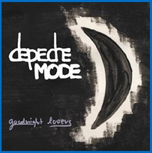


All of the Exciter covers have the same wordmark, but there's not much, er, exciting happening. A pretty picture of people and water, tinted and washed out to near-unrecognisability, some leaves, a faux-naïve painting of the moon. Bland and empty. The remixed cash-in of "Enjoy the Silence" has about 15 different covers which are all variations of this one: distorted images of old computer-fonts spelling 'mode'. Ugly in a different way to "Barrel of a Gun", but ugly nonetheless. The last one in this set is the forst one from Playing the Angel, so again we see the new Depeche Mode tradition of having the first single's cover look an awful lot like the album's cover. In this case, same colours, same magic-marker wordmark, and same 'mascot'. This floppy little guy is the 'symbol' of this album era. An angel? I guess.


Three more singles from Playing the Angel, and a fair amount of cheese. They're starting to look like fan-designed Photoshop pieces, particularly "Suffer Well", which has a disco ball and Courier New. The fourth double-a-side single is pretty much the album cover again, just in grey. Am I being too harsh, by the way? Well, we get another greatest-hits album with a desperately ugly thrown-together cover, and one associated single, "Martyr", with essentially the same cover in black. "Wrong" is the first single from Sounds of the Universe, and shares its coloured stickes in a circle, a design aesthetic that I can't even call Photoshop quality - if anything, it's MS Paint quality. These coloured sticks, however, are black and white. Think about that for a while.


My God, are we still talking about Depeche Mode? All signs indicate that they will never go away, and that as long as there are teenagers, they'll be there with electronic songs featuring David Gahan bellowing Martin Gore's adolescent-angst lyrics. But they won't have very nice single covers. "Peace" is "Wrong" with a peace sign, and the most recent single puts the coloured sticks next to the circle as opposed to inside it. Does any of this mean anything? Of course not. What would be the fun in that?

Saturday, August 21, 2010
Depeche Mode Single Cover Gallery, Part One
I wanted to do Depeche Mode, prime soundtrackers of teen angst for several generations now, but I realised soon what a big project it really is. The album covers actually interested me less than the singles, but Depeche Mode has put out more singles than some bands have individual songs. So I'm just looking at the singles for now, and furthermore breaking that into two parts. This, part one, goes as far as Violator, and as far as I'm concerned the extent of Depeche Mode as an interesting band. But forgive me my prejudices, and let's get started...


"Dreaming of Me" was Depeche Mode's only single not released in multiple formats. So throughout, there are variant covers, and I've just chosen the one that catches my eye most. Though with time, these variant covers would actually be clever 'variations on a theme', in the early days the 7" cover and the 12" cover frequently had nothing whatsoever to do with each other - and "New Life" and "See You" are perfect examples of that. "Dreaming of Me" is charmingly artless, like a high schooler's art project, and all told the Speak and Spell singles are for the most part pretty but personality-less. Since I chose the prettier "See You" cover, "The Meaning of Love" is the only example we have of the god-awful "A Broken Frame" cover era.


"Leave in Silence" is actually from A Broken Frame too, but its clean graphical cover points the way forward. For their third album, Depeche Mode seized on pseudo-Marxist labour-glorification as a theme, and it served them well, with a handful of covers straight out from behind the Iron Curtain. The deliberately ugly "People are People" is a huge misstep, but clearly we'll soon see they'll have learnt their lesson in no time.


Clean graphics and evocative design with yet another 'wordmark' logo for the two remaining Some Great Reward singles, two similar figure-sketch designs for between-album singles and, in "Stripped" a hesitant way forward. "Stripped" was the first single from Black Celebration and thus inaugurates the 'this is a band that actually matters' era of their history. Graphically, we're seeing Wingding-style icons and a lot of black, but not all three singles from this album are made equal.


Black Celebration finishes with a voguish pseudo-vintage Hollywood picture and with a pretty ugly design featuring a girl looking at a broken mirror. From then on, though, Depeche Mode seems to have decided that all covers need to have certain things in common. In the case of Music for the Masses and its four singles, that would be loudspeakers. Orange if possible. So "Strangelove" is all speaker, where "Never let Me Down Again" sticks a speaker icon on its Russian-map design.


"Little 15" keeps the speaker but chucks the orange for a much prettier dark green. The single single from 101 was a live version of "Everything Counts", with a highly bizarre randomly-cropped cover featuring t-shirts and drink glasses, and a band called Dep M. The four Violator covers are more disparate than I remember them. Without various band members fondling a naked woman in turn, "Personal Jesus" is just a scribble. The white rose of "Enjoy the Silence" is, like Dave Gahan's king outfit and the song's chorus, atypically iconic. "Policy of Truth" features different shushing naked women in lurid colours across the formats. And "World in Your Eyes" features different band members making shadow puppets in front of a night-sky cityscape. But at least you got two b-sides.
Coming up next: the less interesting years. Popular in Estonia!
Subscribe to:
Posts (Atom)