At some point in the last half-century or so, the Stones became notable less for the material they (intermittently) produce than for the sheer incredible fact that they are still producing it, all these years later. Longevity has become their single defining trait, and while that's impressive, the fact remains that everything they've done since, oh, 1974 or so has been a footnote.
But obviously their catalogue is going to be long. This is the core studio-album catalogue. No compilations, no live stuff, no boxed sets. Just the main albums - and when we look at the 1960s, that means the British albums, not the American ones. In the 1960s a lot of artists had completely different album releases on either side of the Atlantic. But these are the ones the Stones themselves say when shopping for albums.

The Rolling Stones: The first one out is a beautiful one. The contrast with the Beatles' tackier early covers is clear: this is a classy group portrait, with a tinge of mystery - heightened by the entire lack of text. How did Andrew Loog Oldham get Decca to agree to that?

The Rolling Stones No. 2: This repeats the trick, with diminished returns. They're well-dressed and handsome (interesting that Charlie Watts is most handsome), but the portrait has less character. It's almost a snapshot.

Out of Our Heads: Ah, here's the mystery back again: evocative black and white, a well-framed shot of them perhaps peering between two dumpsters, and text for the first time. Why an asterisk? Oh, that's the mystery, is it?

Aftermath: The American Aftermath is more psychedelic - and that itself is newsworthy, since we're talking early 1966. But this purple-and-black duotone is attention-grabbing. Album title but no band name is curious. And I think the title looks a bit cheesy. Oh well, can't win 'em all.

Between the Buttons: Vaseline on the lens, autumnal mood. Charlie is again the cover star, and even the sublect of the album's title with those two shiny white jacket buttons. And Brian Jones is a character from a J.R.R. Tolkein book.

Their Satanic Majesties Request: The Stones at their acid-inflated silliest. Apparently early versions had a lenticular cover, which is impressive, since 44 years later I still find lenticulars cool. But they look like they were playing in a Hallowe'en costume shop, and none of it is even slightly sincere.

Beggars Banquet: The 'return to roots' album now has that toilet cover. You might call it more 'authentic', since it's the design the Stones themselves originally wanted, but when this album was released, this is what it looked like in stores. Plus, I didn't fancy a picture of a filthy toilet on my blog.

Let It Bleed: Only the second cover not to be a group portrait, incidentally. It's a bit overdone: a faux 78, studio tapes, a clock, a tire and a birthday cake. If it's meant to 'mean' anything, it seems to fail. Just silly, really. And nothing to do with bleeding, perhaps thankfully.

Sticky Fingers: One of the most famous album covers ever. Designed by Andy Warhol and originally released with an actual working zipper. Plus the belt is die-cut to 'work' as well, and if you feel like destroying the album cover, you'll get the same crotch in tighty-whities. Did I mention I've always hates this album's childish title?

Exile on Main St.: Their double-album opus, and as double albums are meant to juxtapose different styles and sounds, this juxtaposes images. Many are freakshow. The end result doesn't look nice on a shelf.

Goat's Head Soup: Mick is back on the cover - his first solo cover (Keith is on the back), and he's wrapped in, er, pantyhose or something. Intriguing, slightly.
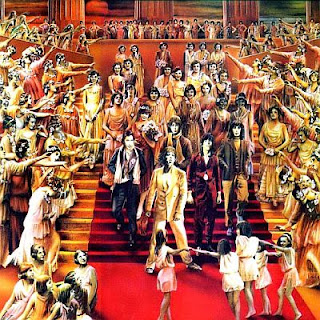
It's Only Rock 'n' Roll: This is the album where the Stones really start to become hacks. This is their take on glam, with an overdone Sgt. Pepper-style cover. Unattractive.

Black and Blue: This weird 'transitional' album has a strange cover, barely a snapshot really, with three of the five Stones on the front, Mick and Bill wearing precisely the same blank expression and Keith looking silly whispering something in Mick's ear. No idea why they chose this picture, though the ocean in the background looks attractive.
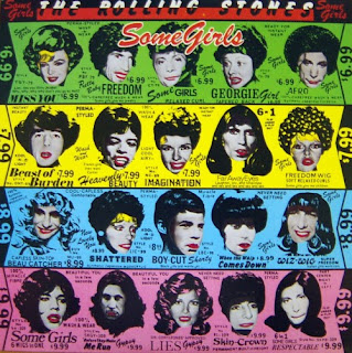
Some Girls: One of the Stones' most famous covers, this is die-cut, with the faces all actually on the inner sleeve. Remove it and they're all wigs with no faces in. The song titles are made to look like the names of wigs, in an ad in a fahion magazine or someting. Lucille Ball was upset at being one of the faces.

Emotional Rescue: When I was a kid, I can remember going to a science exhibition that had a heat-mapping camera. You'd stand in front of it and your heat map would be projected behind you. I loved it, and described it as 'like the Rolling Stones' Emotional Rescue'. I was actually referring to the video for the title track, but it has the same vibe as this messy cover. The Stones are not trying to mean anything, so 'that looks cool' is impetus enough.

Tattoo You: The Stones' outtake album, masquerading as a new studio album. It's a person, who I always thought was a girl but now suspect is Mick Jagger, done up with elaborate squiggles all over his/her face. With an attractive red background.

Undercover: I was told when this came out that the cover was actually a full-frontal nude picture, and that the 'decals' obscuring her naughty bits could be peeled off. I was too young to be able to afford to buy albums, and probably wouldn't have gone for this old-person music anyway, so I spent most of my life believing this, until realising now that a peeled-decal cover would certainly be easy to find by Googling now if such a creature had ever actually existed.

Dirty Work: Colourful. They all look really ridiculous, the evoke the worst excesses of the 80s, and Mick Jagger doesn't look very comfortable at all there. No wonder they broke up - for a few years anyway.

Steel Wheels: The 'comeback' and the first of a stream of albums to be hailed as returns to form upon their release, only to become, within a few years, seen as the hackwork that requires a 'return to form'. Are these wheels? Are they steel? I don't get it - but it's not pretty, anyway.

Voodoo Lounge: Latter-era Stones made some strange choices not only in album titles but in album covers. This looks like a creature from Nickelodeon dancing... or something. Well, it's more attractive than Mick's face.

Bridges to Babylon: Another cartoon character: a blue lion with a King Tut beard-thing. Why? I get the sense that nobody in the whole Stones organisation asks that question. Why? Well, why not?
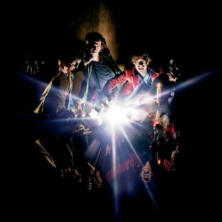
A Bigger Bang: The Stones' most recent studio album returns to form, being most reminiscent of that pretty début all those years ago. A group portrait, lots of black and no text. There seems to be a small star going supernova, and their reflections are not the same mirror-images of their actual pictures. No more meaningful than any other cover, but not ugly either.
But obviously their catalogue is going to be long. This is the core studio-album catalogue. No compilations, no live stuff, no boxed sets. Just the main albums - and when we look at the 1960s, that means the British albums, not the American ones. In the 1960s a lot of artists had completely different album releases on either side of the Atlantic. But these are the ones the Stones themselves say when shopping for albums.

The Rolling Stones: The first one out is a beautiful one. The contrast with the Beatles' tackier early covers is clear: this is a classy group portrait, with a tinge of mystery - heightened by the entire lack of text. How did Andrew Loog Oldham get Decca to agree to that?

The Rolling Stones No. 2: This repeats the trick, with diminished returns. They're well-dressed and handsome (interesting that Charlie Watts is most handsome), but the portrait has less character. It's almost a snapshot.

Out of Our Heads: Ah, here's the mystery back again: evocative black and white, a well-framed shot of them perhaps peering between two dumpsters, and text for the first time. Why an asterisk? Oh, that's the mystery, is it?

Aftermath: The American Aftermath is more psychedelic - and that itself is newsworthy, since we're talking early 1966. But this purple-and-black duotone is attention-grabbing. Album title but no band name is curious. And I think the title looks a bit cheesy. Oh well, can't win 'em all.

Between the Buttons: Vaseline on the lens, autumnal mood. Charlie is again the cover star, and even the sublect of the album's title with those two shiny white jacket buttons. And Brian Jones is a character from a J.R.R. Tolkein book.

Their Satanic Majesties Request: The Stones at their acid-inflated silliest. Apparently early versions had a lenticular cover, which is impressive, since 44 years later I still find lenticulars cool. But they look like they were playing in a Hallowe'en costume shop, and none of it is even slightly sincere.

Beggars Banquet: The 'return to roots' album now has that toilet cover. You might call it more 'authentic', since it's the design the Stones themselves originally wanted, but when this album was released, this is what it looked like in stores. Plus, I didn't fancy a picture of a filthy toilet on my blog.

Let It Bleed: Only the second cover not to be a group portrait, incidentally. It's a bit overdone: a faux 78, studio tapes, a clock, a tire and a birthday cake. If it's meant to 'mean' anything, it seems to fail. Just silly, really. And nothing to do with bleeding, perhaps thankfully.

Sticky Fingers: One of the most famous album covers ever. Designed by Andy Warhol and originally released with an actual working zipper. Plus the belt is die-cut to 'work' as well, and if you feel like destroying the album cover, you'll get the same crotch in tighty-whities. Did I mention I've always hates this album's childish title?

Exile on Main St.: Their double-album opus, and as double albums are meant to juxtapose different styles and sounds, this juxtaposes images. Many are freakshow. The end result doesn't look nice on a shelf.

Goat's Head Soup: Mick is back on the cover - his first solo cover (Keith is on the back), and he's wrapped in, er, pantyhose or something. Intriguing, slightly.

It's Only Rock 'n' Roll: This is the album where the Stones really start to become hacks. This is their take on glam, with an overdone Sgt. Pepper-style cover. Unattractive.

Black and Blue: This weird 'transitional' album has a strange cover, barely a snapshot really, with three of the five Stones on the front, Mick and Bill wearing precisely the same blank expression and Keith looking silly whispering something in Mick's ear. No idea why they chose this picture, though the ocean in the background looks attractive.

Some Girls: One of the Stones' most famous covers, this is die-cut, with the faces all actually on the inner sleeve. Remove it and they're all wigs with no faces in. The song titles are made to look like the names of wigs, in an ad in a fahion magazine or someting. Lucille Ball was upset at being one of the faces.

Emotional Rescue: When I was a kid, I can remember going to a science exhibition that had a heat-mapping camera. You'd stand in front of it and your heat map would be projected behind you. I loved it, and described it as 'like the Rolling Stones' Emotional Rescue'. I was actually referring to the video for the title track, but it has the same vibe as this messy cover. The Stones are not trying to mean anything, so 'that looks cool' is impetus enough.

Tattoo You: The Stones' outtake album, masquerading as a new studio album. It's a person, who I always thought was a girl but now suspect is Mick Jagger, done up with elaborate squiggles all over his/her face. With an attractive red background.

Undercover: I was told when this came out that the cover was actually a full-frontal nude picture, and that the 'decals' obscuring her naughty bits could be peeled off. I was too young to be able to afford to buy albums, and probably wouldn't have gone for this old-person music anyway, so I spent most of my life believing this, until realising now that a peeled-decal cover would certainly be easy to find by Googling now if such a creature had ever actually existed.

Dirty Work: Colourful. They all look really ridiculous, the evoke the worst excesses of the 80s, and Mick Jagger doesn't look very comfortable at all there. No wonder they broke up - for a few years anyway.

Steel Wheels: The 'comeback' and the first of a stream of albums to be hailed as returns to form upon their release, only to become, within a few years, seen as the hackwork that requires a 'return to form'. Are these wheels? Are they steel? I don't get it - but it's not pretty, anyway.

Voodoo Lounge: Latter-era Stones made some strange choices not only in album titles but in album covers. This looks like a creature from Nickelodeon dancing... or something. Well, it's more attractive than Mick's face.

Bridges to Babylon: Another cartoon character: a blue lion with a King Tut beard-thing. Why? I get the sense that nobody in the whole Stones organisation asks that question. Why? Well, why not?

A Bigger Bang: The Stones' most recent studio album returns to form, being most reminiscent of that pretty début all those years ago. A group portrait, lots of black and no text. There seems to be a small star going supernova, and their reflections are not the same mirror-images of their actual pictures. No more meaningful than any other cover, but not ugly either.


