Okay, I'll admit it: I'm doing Pink Floyd now because I think it'll bring lots of viewers here. That's not pure cynicism, though: in doing my three-part retrospective of Hipgnosis's best cover designs, obviously the Floyd are a constant. Perhaps the first rock group to cultivate a very individualistic visual element to their music, Pink Floyd were shrewd enough to understand the importance of iconic album art - the importance, that is, of an album as an objet d'art, with an intrinsic value as an object regardless of the music it contains. And to that end, every Pink Flod cover - even compilations and live releases - is worth a look. Several of the most famous album covers ever are to be found here.
As a side note, I've also decided to abandon the 'roll-over captions' I've been using so far on this blog. I think they're attractive and I think they've helped Google find this site and index it well. But (a) they're really labour-intensive, and (b) they require the covers to be a very particular size (too small for my taste) and not centred. I think this is overall a more attractive look, even if it's more basic. Let's see if Google will still be able to find me...

The Piper at the Gates of Dawn: Yes, Pink Floyd were once hippies. The Piper at the Gates of Dawn is the only album they released with Syd Barrett as a full member, and it sounds like little else in their discography. Neither does the quasi-'kaleidoscope' cover fit in, though it certainly evokes 1967.
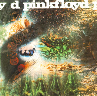
A Saucerful of Secrets: Hipgnosis was actually founded in order to deliver this cover, a beautifully lush piece of sci-fi and science-textbook images melting into one another. Just as era-specific as the début, the Saucerful of Secrets cover has dated much less. But who remembers the album?
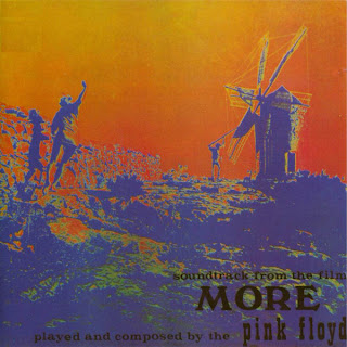
Soundtrack from the Film "More": This is apparently Hipgnosis too, but it doesn't feel like it. It's a duotone image in orange and blue of two people and a windmill, perhaps a still from the movie "More" which this release soundtracks. But perhaps not. This is probably the single easiest-to-overlook album in the Pink Floyd's oeuvre.

Ummagumma: A mess of an album, a live disc together with a disc divided into four solo half-sides, Ummagumma has a silly name but an iconic cover. The design is simple enough, the four members of Pink Floyd in various locations near the back door of a house, with a frame on the wall housing the exact same picture excpet with the four members in different positions and with the frame on that smaller wall containing a third nested picture with the four in again a different position, etc. And for some reason there's the soundtrack to "Gigi" there too.

Atom Heart Mother:The ultimate anti-design, even more than Hipgnosis's later Go 2. A cow. That's all. Yet it's gorgeous and iconic as hell. The best picture of a cow I've ever seen - a cow as cow-y as a cow could be.
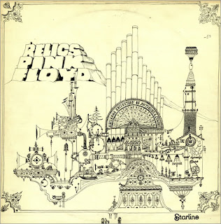
Relics (original): The notoriously difficult-to-compile Floyd's first compilation, Relics is a decent trawl of early single releases and random album tracks, released at a tim when those tracks were barely relics at all. Drummer Nick Mason made the very 1971 sketch on the cover, a kind of Rube Goldberg-style 'impossible machine' that looks like it should have appeared in "Yellow Submarine".

Relics (reissue): Who knows why, but in subsequent years when Relics was reissued on CD, Nick Mason's original was replaced with an actual mock-up of the device he sketched. Clever, and an interesting thing to compare side-by-side, but a pointless exercise in history-rewriting, ultimately.

Relics (American): The Americans got something entirely different. It's completely different, but probably creepier: a four-eyed 'artifact' with a real live human tongue. It's a bit silly, but it works.

Meddle: This Hipgnosis design, a human ear in close-up overlaid with drops on water, has countless variations (just Google it and you'll see). At one end, mostly you notice the ear. At the other end (and the vinyl copy I personally have looks like this one), you can barely notice the ear at all. Not sure why.

Obscured by Clouds: Another soundtrack, pretty obscure for being the Floyd's immediate pre-Dark Side release. The album itself is a minor entry, but the cover, which takes the word 'obscured' and flies with it, is attention-grabbingly fuzzy, bokeh years and years before that became a 'cool' word.

Dark Side of the Moon: What can I say about this? While I'm at it, why don't I criticise the Mona Lisa too? Probably rock music's most iconic album cover, it leaves me with little to say except to point out that there are only six colours in the spectrum and that there are dozens of minor variations of this cover.

A Nice Pair: Useless as a product, this was merely the Floyd's first two albums stuck together with a new cover. The cover is actually 36 different 'covers', arranged 3x3 across the front, back and an inner gatefold. Many are silly (fork in the road?), and overall the effect is underwhelming. But hey - boobs!

Wish You Were Here: In my Hipgnosis round-up, I used the original layout of this cover, not the subsequent CD reissue depicted above. No clue why they toyed with it, but the elements are the same: burning man burns the paper it's printed on while shaking hands in an abandoned Hollywood lot. More than anything, it's just an arresting visual image.

Animals: This is also in my Hipgnosis roundup. It's Animals, Pink Floyd's Orwellian dystopian take on modern society. It's not just the flying pig I love - it's that gorgeously bleak Battersea Power Station.That's what a dark Satanic mill looks like.

The Wall:Not Hipgnosis but still noteworthy: this is Pink Floyd's double-album opus The Wall. The vinyl version I had had the Gerald Scarfe handwriting on a label, and the cover was nothing more than that wall: white bricks and grey mortar. Very modish. We're so used to it that it doesn't mean much anymore, but it's Pink Floyd's second most immediately recognisable cover. And that's impressive.

A Collection of Great Dance Songs: Hipgnosis again, for a pretty poor compilation. The cover is nice though, ballroom dancers tied to the spot with guy wires. In a pretty autumnal farmer's field.

The Final Cut: It might be a Roger Waters solo album released under the name Pink Floyd, but personally I'm much fonder of The Final Cut than many people are. I'm a bit more 'whatever' about its 'medals on a black background' cover, which doesn't always have the text in Courier New on front. It's just not bad. That's all.

Works: A tragically random compilation, with a 'retro' cover that might be visually arresting but frankly has nothing to do with Pink Floyd at all. As the band had essentially broken up by then, I guess no-one really cared either way.

A Momentary Lapse of Reason: The 'comeback', a David Gimour solo album under the name Pink Floyd, just as authentic as The Final Cut but less interesting, musically. Not a reunion with Roger Waters, but a reunion with Storm Thorgerson of Hipgnosis, who actually arranged all of these beds on the beach. A lot of work for an albujm cover, isn't it?

Delicate Sound of Thunder: A live album. A guy wears light bulbs and someone else is surrounded by... well, I can't tell. This is typical Storm Thorgerson stuff, but it doesn't really work. It seems like the work of an imitator for some reason. I'm not sure why. It's just... underwhelming.

The Division Bell:Two huge metal statues talking to each other. Hm. This is the final Pink Floyd studio album, and it's rather easy to overlook. This is a real photograph, by the way. They really did build and erect these statues.
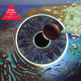
P*U*L*S*E: Another live album. This cover was famous for the flashing LED embedded in the spine. Those batteries have long since gone dead, and reissues are less flashy. Still, it's nice, if a bit overwrought: a human iris as the centre of the solar system, with fish and other stuff around it. It's all reissues from now on. Pink Floyd officially bow out with Pulse.
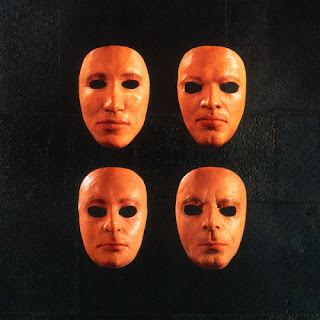
Is There Anybody Out There? - The Wall Live 1980-81: A twenty-year-old recording of Pink Floyd playing The Wall live in concert, this is rather less than essential a release. The cover is nicely grotesque though, the 'life-masks' of the four members of Pink Floyd, worn by a 'fake Pink Floyd' on-stage. Not the most attractive band in the world, were they?

Echoes: By no small distance by far the most successful attempt at 'compiling' Pink Floyd, Echoes is a 2CD 'greatest hits' that makes a virtue of the band's remarkable transformation down the years. This is Storm Thorgerson with his one-millionth Pink Floyd cover, and its Ummagumma-like series of windows in windows hides dozens of visual references to Pink Floyd album covers, album titles, song titles and lyrics.

Oh, By the Way: By now, the Pink Floyd reissue programme was being carried out entirely by robots, who every few years would put out something like this: this is a box set compiling all of Pink Floyd's original studio albums, with a 'meaningful images arranged together' cover that once again apes Ummagumma. Sadly unconvincing.
As a side note, I've also decided to abandon the 'roll-over captions' I've been using so far on this blog. I think they're attractive and I think they've helped Google find this site and index it well. But (a) they're really labour-intensive, and (b) they require the covers to be a very particular size (too small for my taste) and not centred. I think this is overall a more attractive look, even if it's more basic. Let's see if Google will still be able to find me...

The Piper at the Gates of Dawn: Yes, Pink Floyd were once hippies. The Piper at the Gates of Dawn is the only album they released with Syd Barrett as a full member, and it sounds like little else in their discography. Neither does the quasi-'kaleidoscope' cover fit in, though it certainly evokes 1967.

A Saucerful of Secrets: Hipgnosis was actually founded in order to deliver this cover, a beautifully lush piece of sci-fi and science-textbook images melting into one another. Just as era-specific as the début, the Saucerful of Secrets cover has dated much less. But who remembers the album?

Soundtrack from the Film "More": This is apparently Hipgnosis too, but it doesn't feel like it. It's a duotone image in orange and blue of two people and a windmill, perhaps a still from the movie "More" which this release soundtracks. But perhaps not. This is probably the single easiest-to-overlook album in the Pink Floyd's oeuvre.

Ummagumma: A mess of an album, a live disc together with a disc divided into four solo half-sides, Ummagumma has a silly name but an iconic cover. The design is simple enough, the four members of Pink Floyd in various locations near the back door of a house, with a frame on the wall housing the exact same picture excpet with the four members in different positions and with the frame on that smaller wall containing a third nested picture with the four in again a different position, etc. And for some reason there's the soundtrack to "Gigi" there too.

Atom Heart Mother:The ultimate anti-design, even more than Hipgnosis's later Go 2. A cow. That's all. Yet it's gorgeous and iconic as hell. The best picture of a cow I've ever seen - a cow as cow-y as a cow could be.

Relics (original): The notoriously difficult-to-compile Floyd's first compilation, Relics is a decent trawl of early single releases and random album tracks, released at a tim when those tracks were barely relics at all. Drummer Nick Mason made the very 1971 sketch on the cover, a kind of Rube Goldberg-style 'impossible machine' that looks like it should have appeared in "Yellow Submarine".

Relics (reissue): Who knows why, but in subsequent years when Relics was reissued on CD, Nick Mason's original was replaced with an actual mock-up of the device he sketched. Clever, and an interesting thing to compare side-by-side, but a pointless exercise in history-rewriting, ultimately.

Relics (American): The Americans got something entirely different. It's completely different, but probably creepier: a four-eyed 'artifact' with a real live human tongue. It's a bit silly, but it works.

Meddle: This Hipgnosis design, a human ear in close-up overlaid with drops on water, has countless variations (just Google it and you'll see). At one end, mostly you notice the ear. At the other end (and the vinyl copy I personally have looks like this one), you can barely notice the ear at all. Not sure why.

Obscured by Clouds: Another soundtrack, pretty obscure for being the Floyd's immediate pre-Dark Side release. The album itself is a minor entry, but the cover, which takes the word 'obscured' and flies with it, is attention-grabbingly fuzzy, bokeh years and years before that became a 'cool' word.

Dark Side of the Moon: What can I say about this? While I'm at it, why don't I criticise the Mona Lisa too? Probably rock music's most iconic album cover, it leaves me with little to say except to point out that there are only six colours in the spectrum and that there are dozens of minor variations of this cover.

A Nice Pair: Useless as a product, this was merely the Floyd's first two albums stuck together with a new cover. The cover is actually 36 different 'covers', arranged 3x3 across the front, back and an inner gatefold. Many are silly (fork in the road?), and overall the effect is underwhelming. But hey - boobs!

Wish You Were Here: In my Hipgnosis round-up, I used the original layout of this cover, not the subsequent CD reissue depicted above. No clue why they toyed with it, but the elements are the same: burning man burns the paper it's printed on while shaking hands in an abandoned Hollywood lot. More than anything, it's just an arresting visual image.

Animals: This is also in my Hipgnosis roundup. It's Animals, Pink Floyd's Orwellian dystopian take on modern society. It's not just the flying pig I love - it's that gorgeously bleak Battersea Power Station.That's what a dark Satanic mill looks like.

The Wall:Not Hipgnosis but still noteworthy: this is Pink Floyd's double-album opus The Wall. The vinyl version I had had the Gerald Scarfe handwriting on a label, and the cover was nothing more than that wall: white bricks and grey mortar. Very modish. We're so used to it that it doesn't mean much anymore, but it's Pink Floyd's second most immediately recognisable cover. And that's impressive.

A Collection of Great Dance Songs: Hipgnosis again, for a pretty poor compilation. The cover is nice though, ballroom dancers tied to the spot with guy wires. In a pretty autumnal farmer's field.

The Final Cut: It might be a Roger Waters solo album released under the name Pink Floyd, but personally I'm much fonder of The Final Cut than many people are. I'm a bit more 'whatever' about its 'medals on a black background' cover, which doesn't always have the text in Courier New on front. It's just not bad. That's all.

Works: A tragically random compilation, with a 'retro' cover that might be visually arresting but frankly has nothing to do with Pink Floyd at all. As the band had essentially broken up by then, I guess no-one really cared either way.

A Momentary Lapse of Reason: The 'comeback', a David Gimour solo album under the name Pink Floyd, just as authentic as The Final Cut but less interesting, musically. Not a reunion with Roger Waters, but a reunion with Storm Thorgerson of Hipgnosis, who actually arranged all of these beds on the beach. A lot of work for an albujm cover, isn't it?

Delicate Sound of Thunder: A live album. A guy wears light bulbs and someone else is surrounded by... well, I can't tell. This is typical Storm Thorgerson stuff, but it doesn't really work. It seems like the work of an imitator for some reason. I'm not sure why. It's just... underwhelming.

The Division Bell:Two huge metal statues talking to each other. Hm. This is the final Pink Floyd studio album, and it's rather easy to overlook. This is a real photograph, by the way. They really did build and erect these statues.

P*U*L*S*E: Another live album. This cover was famous for the flashing LED embedded in the spine. Those batteries have long since gone dead, and reissues are less flashy. Still, it's nice, if a bit overwrought: a human iris as the centre of the solar system, with fish and other stuff around it. It's all reissues from now on. Pink Floyd officially bow out with Pulse.

Is There Anybody Out There? - The Wall Live 1980-81: A twenty-year-old recording of Pink Floyd playing The Wall live in concert, this is rather less than essential a release. The cover is nicely grotesque though, the 'life-masks' of the four members of Pink Floyd, worn by a 'fake Pink Floyd' on-stage. Not the most attractive band in the world, were they?

Echoes: By no small distance by far the most successful attempt at 'compiling' Pink Floyd, Echoes is a 2CD 'greatest hits' that makes a virtue of the band's remarkable transformation down the years. This is Storm Thorgerson with his one-millionth Pink Floyd cover, and its Ummagumma-like series of windows in windows hides dozens of visual references to Pink Floyd album covers, album titles, song titles and lyrics.

Oh, By the Way: By now, the Pink Floyd reissue programme was being carried out entirely by robots, who every few years would put out something like this: this is a box set compiling all of Pink Floyd's original studio albums, with a 'meaningful images arranged together' cover that once again apes Ummagumma. Sadly unconvincing.


